Redesigning Innovation Saskatchewan: bringing their brand and vision to life
We rebuilt Innovation Saskatchewan's site, starting with a collaborative IA. We translated their brand guide into a futuristic art direction. Our team delivered an aesthetic, robust site with flexible content management.
Project overview
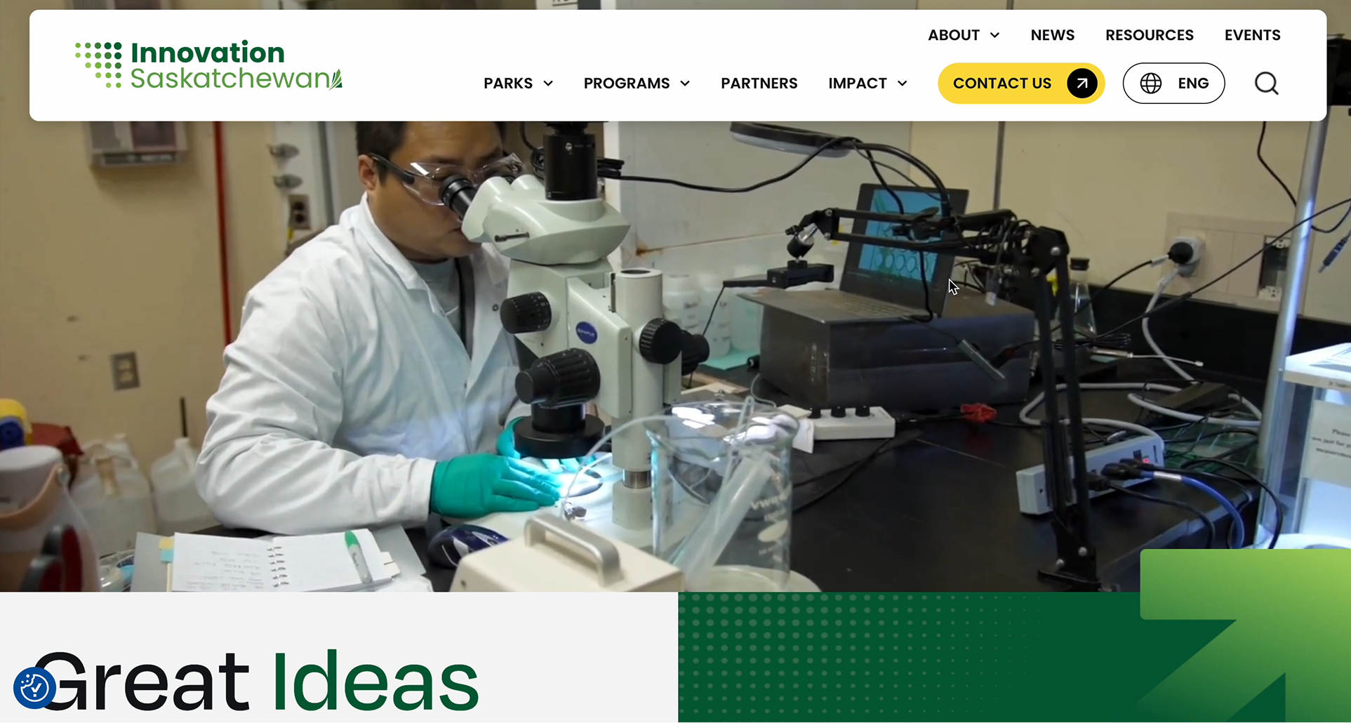
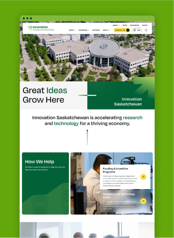
Rebuilt the site with a futuristic art direction using brand colors, gradients, and sharp patterns.
The brand style guide, organisation theme, motto, and logo inspired all design patterns, reinforcing the theme of growth.
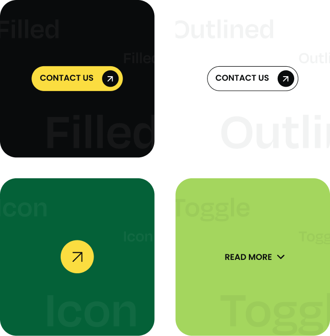
Implemented extensive front-end animations, including sliders, micro-interactions, and unique CTA hover effects.
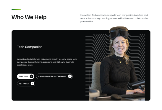
Integrated dense content into an aesthetic, user-friendly, responsive, and WCAG 2.2 AA accessible design.
Launched the WordPress CMS on Azure with full team collaboration (PM, front-end, DevOps).
Challenges
Turning a static brand guide into a complex and futuristic website design.
Architecting a clean, engaging layout for the large volume of new, in-depth client content.
Building heavy front-end animations and sliders that remained fast and fully responsive on mobile devices.
Balancing a wide range of new features and art direction goals within the project's scope.
Ensuring the dynamic, custom-built website met strict WCAG 2.2 AA accessibility requirements.
Key improvements
The new, expressive design aligns with their mission and delivers a visually engaging user experience.
Fast loading speeds and a fully responsive design ensure seamless functionality across all devices.
A strategic structure allows visitors to easily navigate and access the specific content they need.
The brand's "growth and innovation" theme is now dynamically reinforced through site-wide animations and interactions.
The site is inclusive with WCAG AA-level compliance and guarantees 99.99% uptime.
Discover
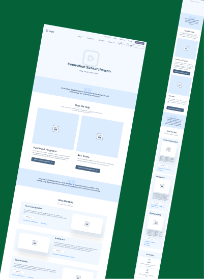
Co-created a new Information Architecture (IA) with the client, establishing a blueprint for their new content.
Defining a new art direction was a major part of this phase.
We analyzed their brand style guide to set a futuristic and innovative theme.
This analysis identified the core foundations: brand colors, the arrow motif, and wavy contour lines.
We established from the outset that animation would be essential to bringing this theme to life.
Define
Defined the core strategy: translating the futuristic art direction into a concrete visual yet functional design.
Set clear technical requirements for the project build.
Selected WordPress as the flexible CMS and Azure as the robust, high-performance hosting platform.
Focused on creating a scalable system that could support the new information architecture.
Prioritized the system's ability to handle heavy animations while meeting strict WCAG 2.2 AA standards.
Design
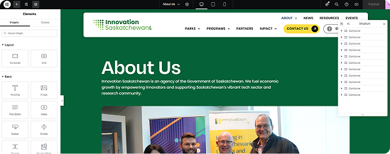
Our teams executed the full build, translating the art direction and design into a high-performance product.
The front-end team built the entire responsive interface, ensuring all animations and brand elements worked seamlessly.
The back-end team developed the Elementor environment within WordPress, configuring global styles and pre-built templates.
Our full team, including DevOps, managed the integration, rigorous accessibility testing, and launch onto Azure to guarantee 99.99% uptime.
Project impact
A few unique solutions designed for this client
We took the abstract wavy contour lines from the brand style guide and used them as a core part of the design. Instead of leaving large areas of white space, these lines function as a dynamic background texture. This fills the page with a sense of motion and reinforces the "scientific" art direction without adding visual clutter.
We used animation strategically to guide users and reinforce the "growth" theme. This included a large banner slider to showcase multiple key messages, animated infographics to draw attention to key data, and many more subtle effects to make the site feel alive. Even small micro-interactions, like the CTA buttons revealing a diagonal arrow on hover, were designed to improve engagement while reinforcing the brand logo and its theme of progress.
We built a custom Elementor workflow by loading all brand styles into global settings. Also the clients can copy components from existing pages to build new ones. All styles apply instantly, empowering them to easily create unique, on pages without needing a technical assistance.