Designing strength: Art direction for OCFA’s website redesign
OCFA, serving over 3 million California residents, is undergoing a website redesign. This effort leverages art direction to establish a powerful digital identity. Exemplifi's approach blends authentic imagery, strategic typography, and a refined palette to project OCFA's strength and community values, guiding the ongoing development.
Project overview
OCFA required a complete website redesign to better reflect its strength, professionalism, and community focus
Exemplifi led the art direction to shape a bold, cohesive visual identity
The design balanced the rugged essence of firefighting with modern aesthetics
Prioritized a user experience that is both accessible and intuitive
Challenges
The previous website lacked a strong visual identity and didn’t reflect OCFA’s strength, urgency, or credibility
A new design language was needed to capture the authenticity of firefighting while maintaining consistency and clarity
The challenge was to create a bold, textured design without compromising usability or accessibility for public users and internal teams
Key improvements
A rugged, authentic design sets OCFA apart from other fire service websites, creating a strong and memorable visual identity
Refined typography, color palette, and custom elements reinforce OCFA’s professionalism and core values
Clean layouts and intuitive navigation enhance usability and make key information easy to access
Discover
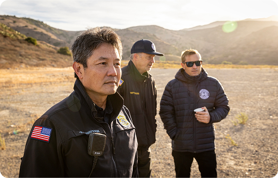
Exemplifi conducted a discovery phase to understand OCFA’s brand challenges, audience diversity, and storytelling opportunities. We reviewed competitor sites, studied user expectations, and analyzed OCFA’s existing imagery and communications for tone and authenticity. Our findings pointed toward a creative direction grounded in realism, strength, and emotional connection.
Define
The team aligned on a design objective: visually convey the strength and urgency of firefighting while maintaining clarity, accessibility, and professional polish. We prioritized typographic hierarchy, emotional imagery, and refined iconography to build a cohesive design system around OCFA’s brand values.
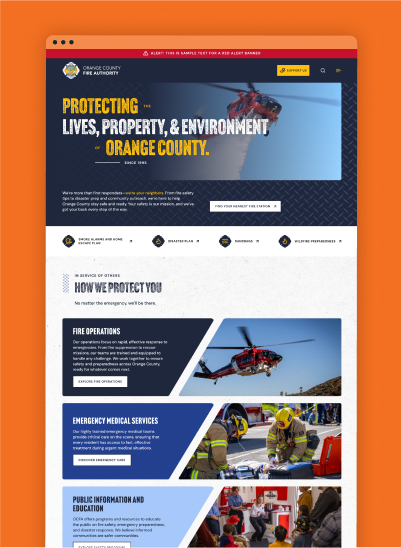
Design
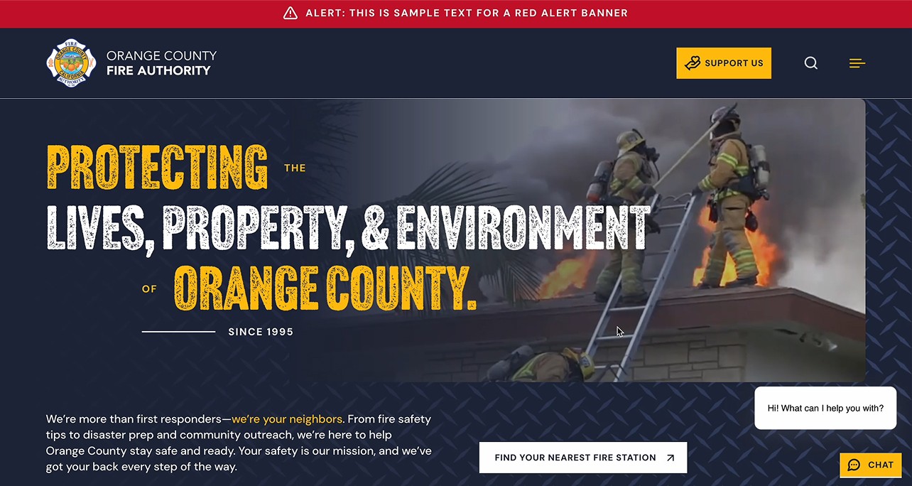
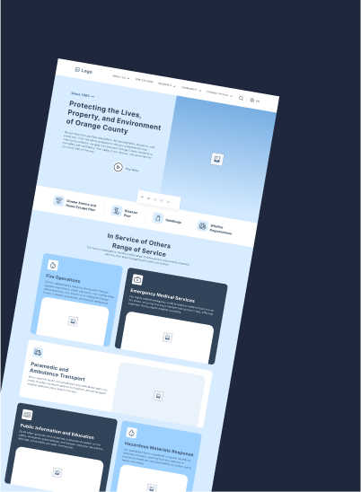
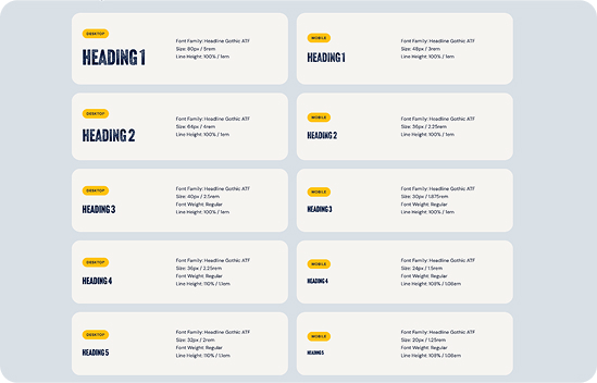
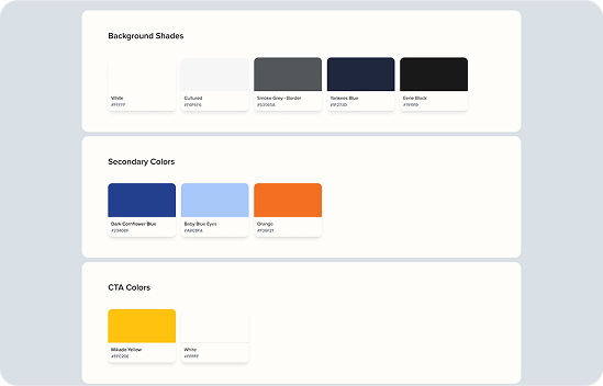
We developed a design language that amplified OCFA’s authority and accessibility. Typography choices like Headline Gothic ATF emphasized strength, while DM Sans ensured clarity and readability. A tailored color palette of core blue, accented by yellow and orange, brought energy and urgency. Authentic imagery was curated to show the human side of firefighting without dilution. Custom icons and structured layouts were integrated to support navigation and elevate the site’s professional tone.
Project impact
Our design language: Typography, color, Imagery, icons and structure
Headline Gothic ATF:
We selected this bold, condensed typeface for headlines to convey authority and strength. Its commanding presence aligns with the resilience and intensity of firefighting, making it ideal for key messaging.
DM Sans:
For body text, we chose DM Sans, a geometric sans-serif font, to ensure clarity and readability. Its modern, approachable tone balances the boldness of the headlines, creating a harmonious visual hierarchy.
Why It Works:
The combination of Headline Gothic ATF and DM Sans reflects OCFA’s dual identity—strong and authoritative, yet approachable and professional. This typography system ensures that critical information is both impactful and easy to read.
Core Blue:
We retained OCFA’s core blue to maintain a professional and trustworthy tone, reinforcing the organization’s reliability and sophistication.
Yellow and Orange Accents:
These energetic tones were introduced strategically to evoke urgency and action, mirroring the dynamic nature of firefighting. They are used sparingly for calls to action and key messaging to draw attention without overwhelming the user.
Why It Works:
This refined color palette reinforced OCFA’s mission, ensuring a bold yet approachable appearance across all digital touchpoints.
Content Hierarchy:
We designed the site with a clean layout, focusing on clear content hierarchy to ensure users can quickly access critical information.
Balanced Design:
The combination of rugged textures and clean layouts ensures the website feels bold and impactful without overwhelming the user experience.
Why It Works:
The structured layout enhances usability, making it easy for users to navigate the site and find the information they need.
A full library of line-drawn illustrations was developed, providing visual cues while ensuring design consistency. These icons complemented the bold layout and reinforced a unified brand system.
We designed a clear content hierarchy, using modular layouts and rugged visual textures to ensure users could easily access essential services. This structure allowed the bold visuals to shine while keeping the site accessible and intuitive.
A next-gen website for public utility services