A fusion of bold design & robust technology: the JTA redesign
We engineered a complete digital transformation for JTA, blending a bold design with vibrant red hues and confident typography. Using Umbraco CMS and Vue.js, we crafted a high-performance platform that captures their innovative brand spirit.
Project overview
Modernize the website with a bold, energetic, and creative design concept.
Establish a distinct and memorable brand identity through a unique visual language.
Rebuild the platform on a flexible and powerful Umbraco 16 CMS architecture.
Migrate to a fully cloud-based infrastructure on Azure for scalability and performance.
Ensure the new site stands out and solidifies JTA's position as an industry leader.
Challenges
The existing website lacked a strong visual identity that matched JTA's innovative spirit.
A generic design aesthetic failed to differentiate JTA from other transit agencies.
The underlying platform (Umbraco 8) needed a significant upgrade, requiring a full rebuild rather than a simple migration.
The project demanded a rapid turnaround, with a tight deadline for launch.
The new architecture needed to be fully cloud-native, moving all assets to Azure Blob Storage for enhanced performance.
Key improvements
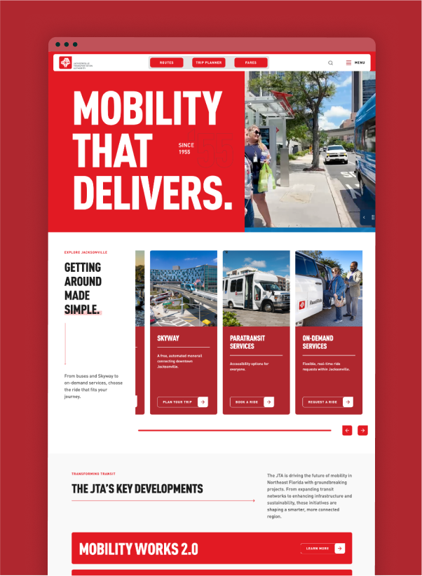
Enhanced visual identity with a vibrant red palette and bold typography
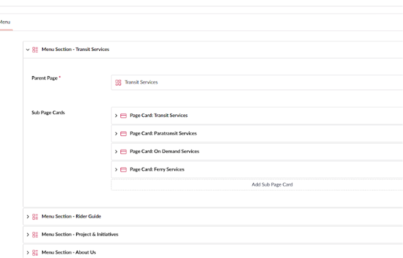
Modular content blocks in Umbraco for easier content management
Faster page load times through Azure Blob Storage
Confident typography reinforcing JTA’s modern leadership
Discover
Exemplifi conducted an in-depth discovery phase to understand JTA's core identity as an innovator. We identified the need for a website that not only made a bold statement but was also built on a modern, scalable technical foundation. The key challenge was to architect a solution that was as forward-thinking as JTA itself.
Define
The team defined the project's vision, emphasizing a dynamic and vibrant concept backed by a robust technical foundation. We established key design pillars, including a vibrant color palette and confident typography, while also addressing the technical needs—rebuilding the platform on Umbraco 16 and designing a new production architecture within Azure.
Design
With a well-defined strategy, we crafted a high-performance website that brings JTA's energy to life. We prioritized a confident aesthetic and completely re-architected the entire solution on Umbraco 16. By moving to a fully cloud-based environment in Azure with assets in Blob Storage, we ensured the site is not only visually striking but also exceptionally fast, responsive, and secure.
Project impact


A few unique solutions that we designed for JTA.
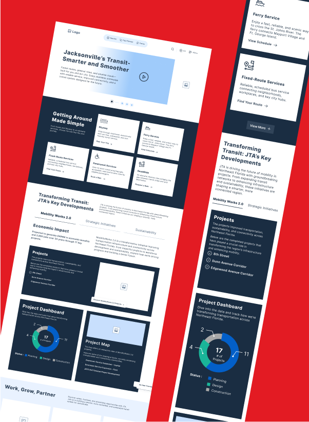
We developed a system of custom, reusable content blocks within the Umbraco CMS. This modular approach allows JTA to build dynamic and visually consistent pages with ease, ensuring the powerful brand identity remains intact across the entire site without needing developer intervention for content updates.
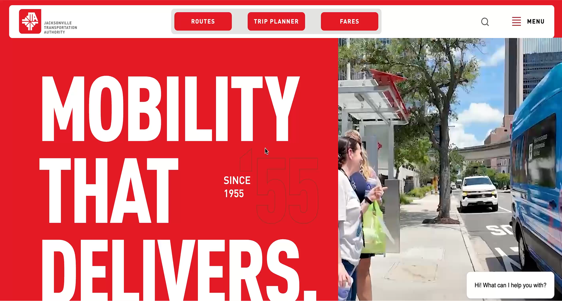
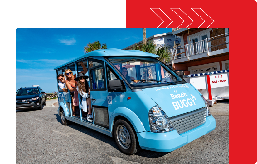
We embraced a creative concept that felt bold and energetic. This is most evident in the primarily red palette that immediately infuses energy into any composition and creates a vibrant feel unique to JTA's core identity. Such a focused palette can be challenging to design, but the result is a distinct and powerful identity.
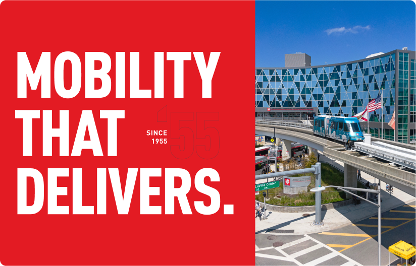
The site's typography is a cornerstone of its confident and energetic identity. We implemented a bold, all-caps type system that creates a strong statement on every page. This approach moves beyond simple readability, using text as a powerful design element that reinforces JTA's position as a modern and assertive leader in the transit industry. The clean, strong letterforms contribute to the site's dynamic feel and ensure the brand's voice is both clear and commanding.
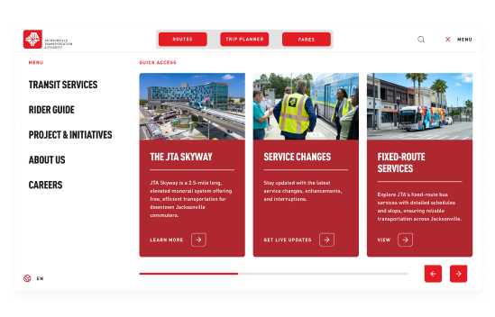
To infuse movement and energy, we added subtle arrow design elements throughout the pages. Arrows are an often-overused motif in the transit industry, so we made sure to use them in unique, abstract, and aesthetically pleasing ways that guide the user's eye and create a sense of dynamism without feeling cliché.
Gold standard accessibility achieved for SacRT
High-performance transit platform with interactivity, API-driven alerts