
Using Google Maps to build interactive transit maps with real-time schedules

Introduction
Google Maps was used to build an interactive visual map interface with interactive station markers for our transit client Acerail's website catering to both first-time users and repeated visitors to provide an easy-to-use way to explore the routes. In addition, the schedules page was built to provide users with accurate train timings. The solution was designed by setting up the Google Map API key, building the information parts, and more. Read till the end to find out more about the interactive transit map solution with real-time schedules and the step-by-step process of designing it.
Acerail
Altamont Commuter Express (ACE) is a regional commuter rail service connecting Stockton and San Jose in Northern California. It offers comfortable trains, convenient schedules, and amenities like Wi-Fi. ACE provides a sustainable and efficient transportation option for commuters traveling between the Central Valley and the Bay Area, with connections to other modes of transportation.
ACE operates trains on weekdays, with limited service available on weekends for special events. The trains generally offer morning and evening commute options, aligning with typical work hours. The frequency of trains varies depending on the specific route and time of day.
It serves as a vital transportation link for commuters in Northern California, providing an efficient and sustainable option for traveling between the Central Valley and the San Francisco Bay Area.
The Design Problem
We were presented with a challenge: revamp the existing website to address the specific needs of daily commuters and create a modern, user-friendly, and responsive platform. One of the key aspects we needed to tackle was optimizing the train schedule experience. Understanding that there were two primary groups of users – first-time visitors and regular commuters – we needed to find effective solutions for each.
For first-time visitors, we aimed to provide an intuitive and informative experience. We needed to present essential information such as station stops, route maps, and details about connecting bus routes in a clear and easily accessible manner. Our goal was to ensure that new users could quickly understand the service and its offerings, enabling them to make informed decisions about their commuting needs.
For regular commuters, the challenge was to create a seamless and efficient way to access real-time train schedules. We needed to develop a user-friendly interface that allowed commuters to effortlessly find the next train arrival time at their specific station and obtain departure times for their desired destinations. The interface had to be responsive across various devices, ensuring that commuters could access the information they needed on the go.
In summary, the design problem we faced encompassed several key elements. Firstly, we needed to address the scheduling aspect, which involved five southbound trains in the morning and five northbound trains in the afternoon. This required careful consideration of how to present the train schedules in a clear and organized manner, ensuring that users could easily identify the specific train they needed based on their desired direction and time of travel.
Another crucial aspect was providing users with the ability to browse the train line and familiarize themselves with the various stations it stops at. We aimed to create a user-friendly interface that allowed individuals to explore the route map, understand the sequence of stations, and access information about the services available at each stop. This would enable commuters, especially first-time visitors, to plan their journeys effectively and gain a comprehensive understanding of the services offered by the train line.
Additionally, we recognized the need to prioritize the experience of daily commuters who needed to quickly orient themselves in the right direction (north or south) and obtain real-time train arrival information. We wanted to develop a streamlined feature that would enable these commuters to easily determine when the next train was arriving at their specific station, facilitating efficient time management and reducing potential travel-related stress.
In tackling these design challenges, we aimed to create an intuitive and user-centric interface that seamlessly addressed the needs of both first-time users and daily commuters. By incorporating features such as clear train schedules, interactive route maps, and real-time arrival updates, we strived to enhance the overall experience and provide commuters with a reliable and efficient platform for accessing train information.
Our Design Solution
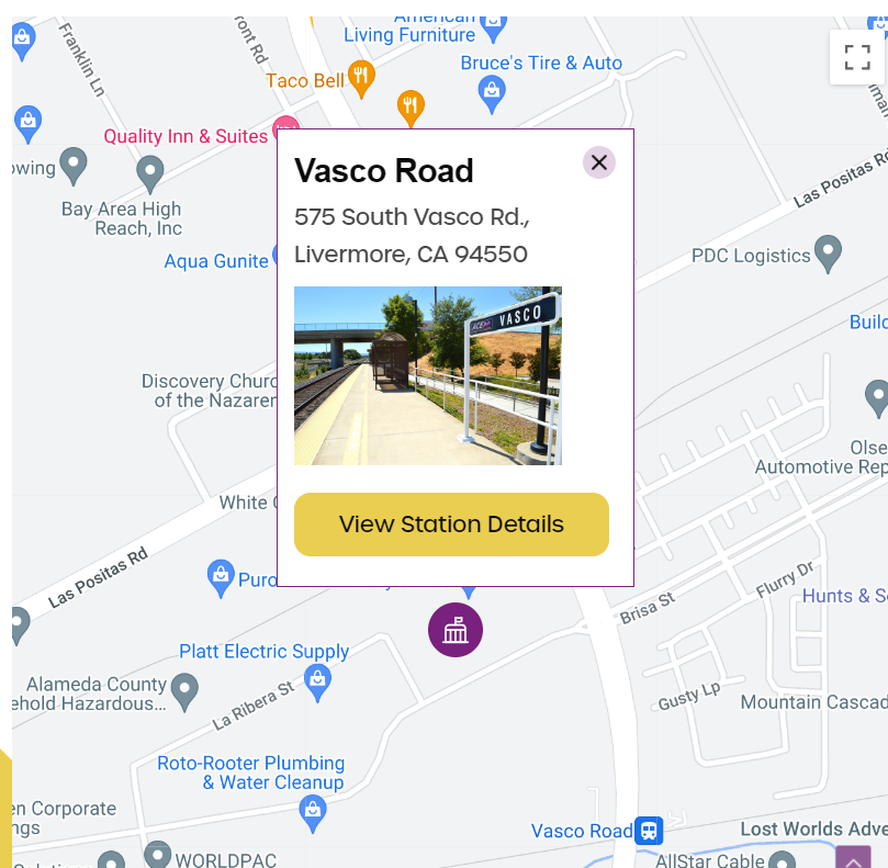
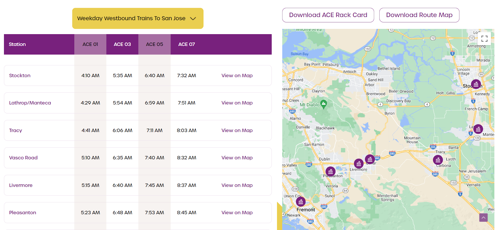
The key to solve both first-time commuters and daily commuters needs, was to start with a complete redesign of the Schedules page of AceRail. We created a solution that provided an answer to all the pain points of both user categories. We started with the Visual Map interface that would help commuters get an eagle's view of each station. The map interface gives users an idea of where stations are located (through brightly colored markers) It also includes zoom-in features for exact specifications to help them feed it into their Google Maps or other navigation systems, to plan their commute accordingly.
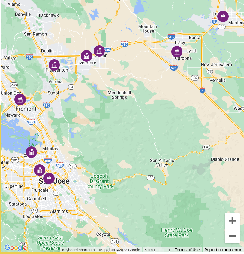
Each one of these station markers can be clicked on to get the exact address of the station. There is also an option to get additional station details including facilities, parking and ticketing information about the station which gives commuters a complete sense of what to expect and how to prepare.
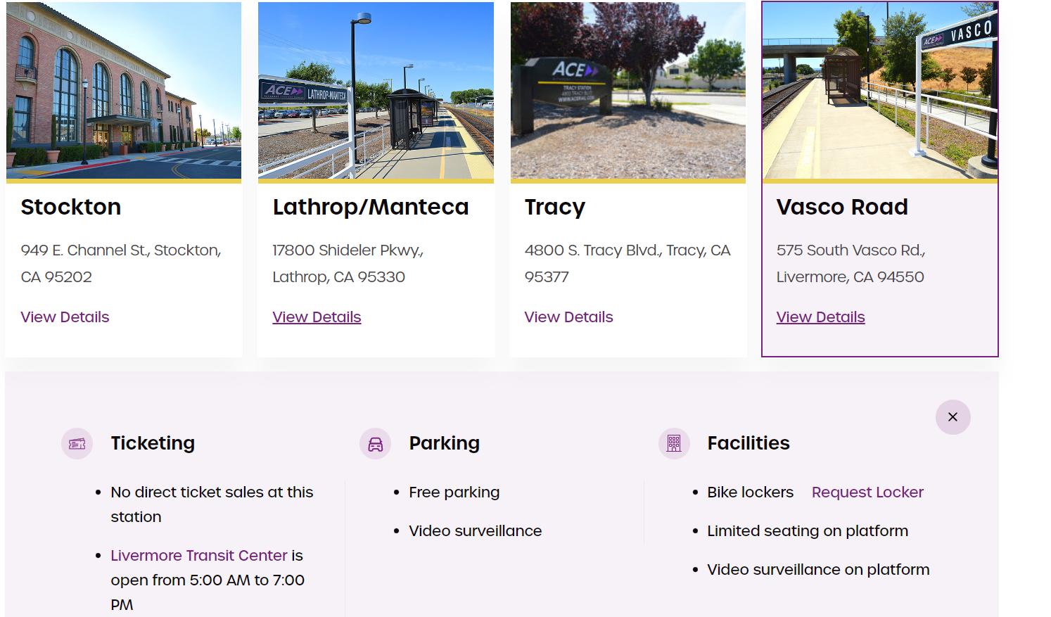
We designed these features of the Visual map to provide commuters with an easy-to-use way to explore their route, the distance between stations, and the amenities available at the station. Each route can also be downloaded easily with a single click.
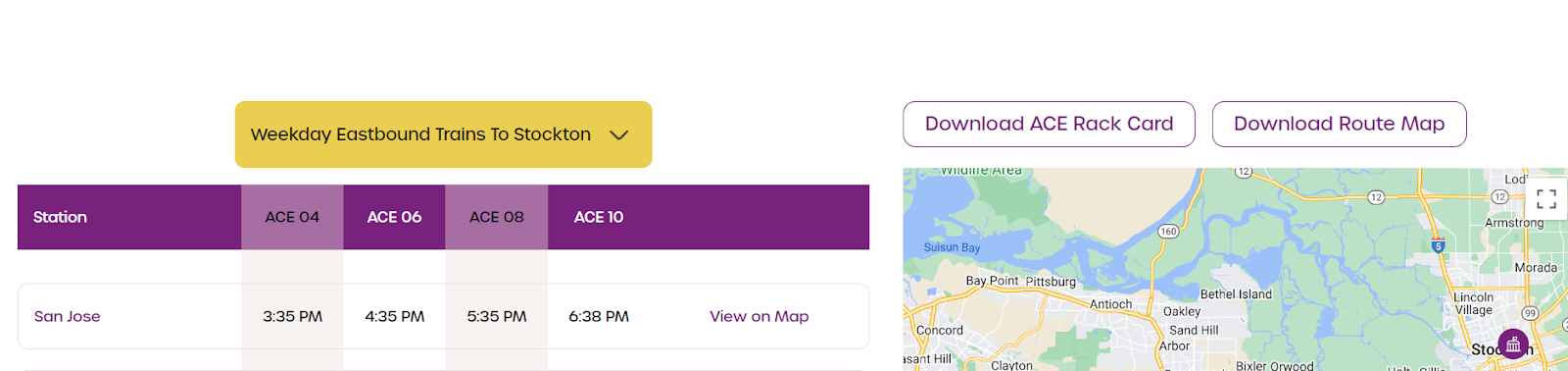
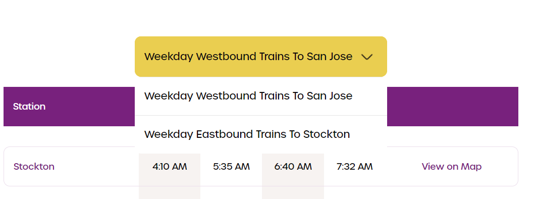
Next, we rebuilt their schedules time sheet to provide the information that repeat commuters tend to be yearning for the most - accurate train timings. We created an API to provide real-time train arrival timings at each station, a filtering system to select between westbound and eastbound trains, and a single-click map view to easily visualize the journey.
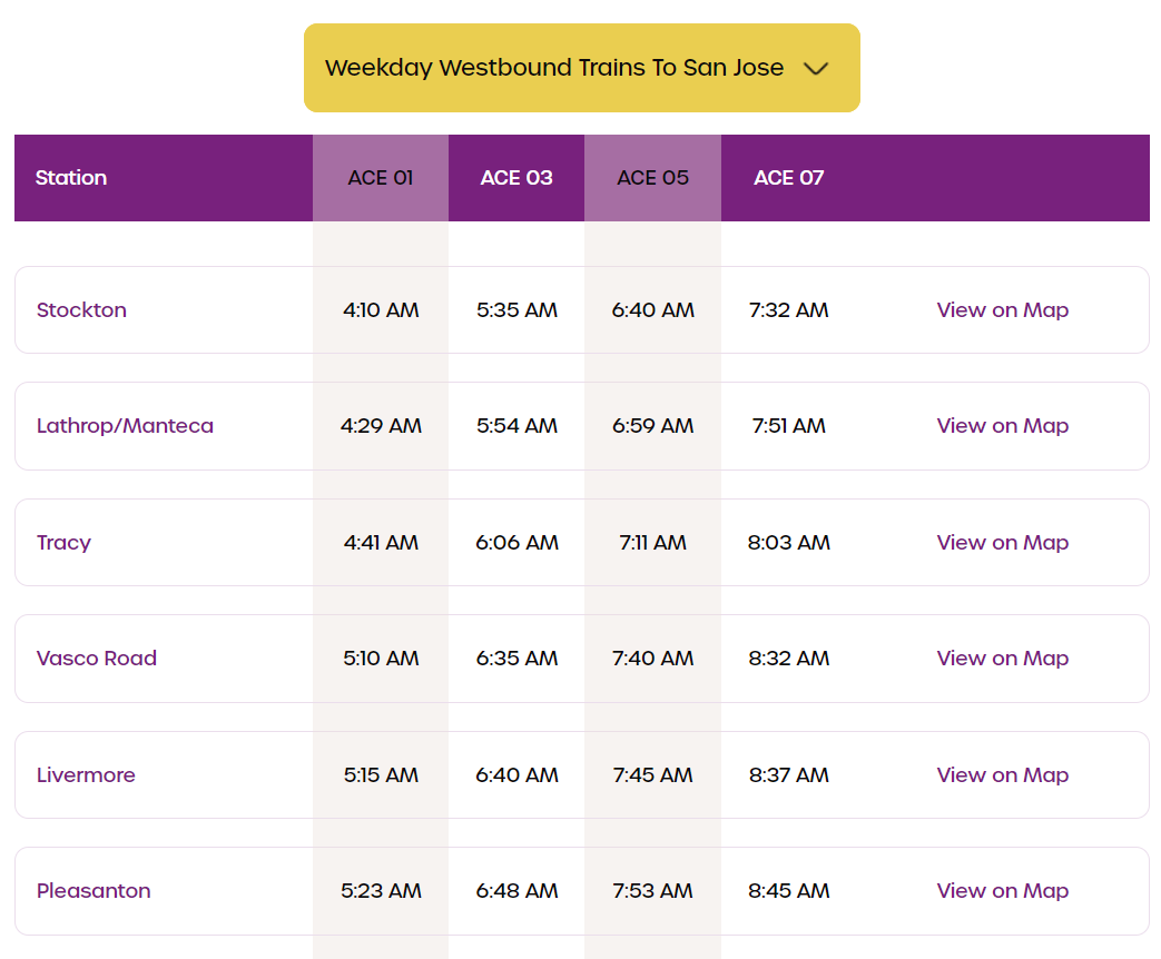
With these features, we found a way to create a visually appealing website that solved the pain points of both categories of commuters. For the first timers, there were easy options to explore, familiarize and plan their journeys to and fro from the ACERail stations. For the regular commuters, it gave them the insight they needed on real-time train schedules which they could access quickly and across all devices. This is what the final page looks like, easy on the eyes, intuitive to use, informative, and blazing fast across devices.
How we implemented this Design
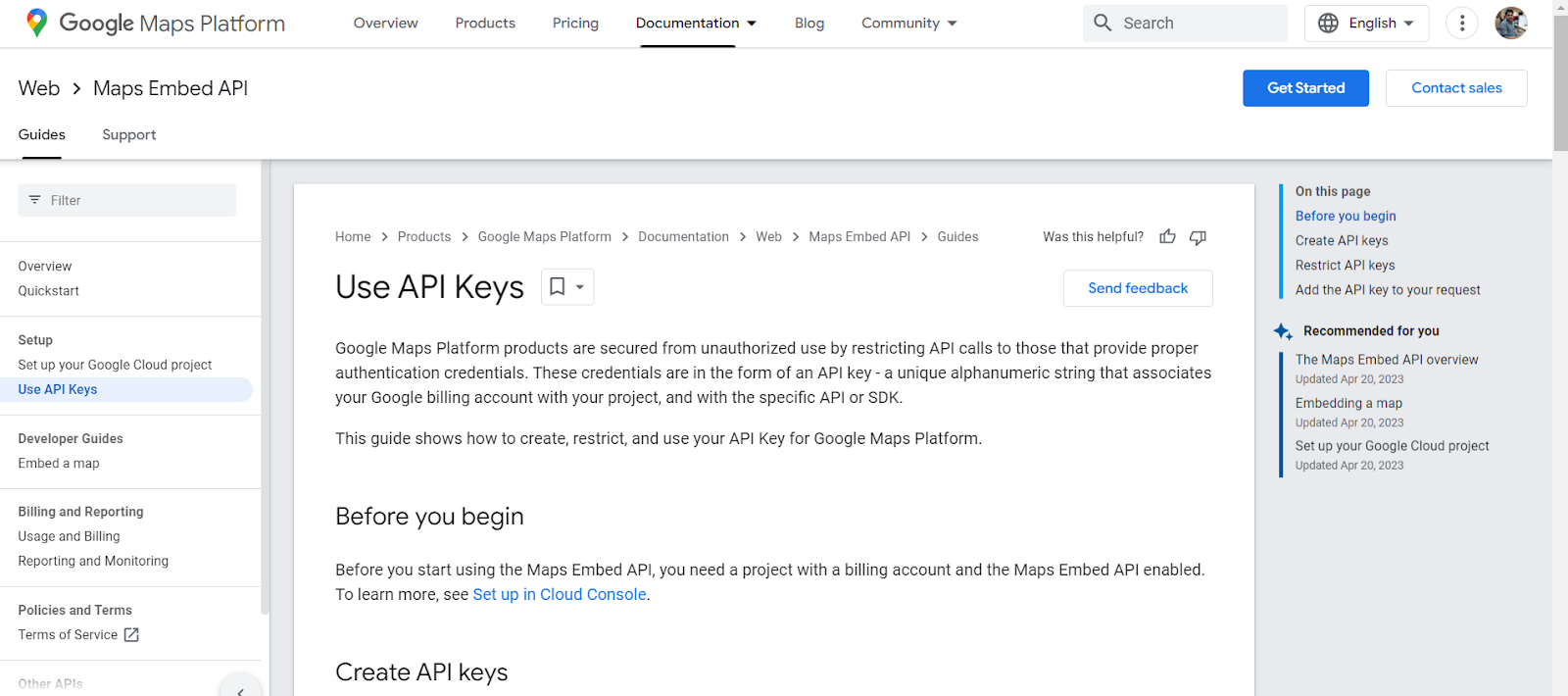
Setting up the Google Map API Key
To create a Google Maps API key for the project, first, we logged into the Google Cloud Console. Once there, we navigated to the Library page and enabled the Maps JavaScript API. Next we went to the Credentials page, created credentials, and selected the API Key button to generate a new key. We then added the AceRail URL to be linked to this new key and voila, we had now sync’d our Google Maps data with our AceRail maps.
Building the information parts and markers
An InfoWindow displays content (usually text or images) is a popup window above the map, at a given location. The info window has a content area and a tapered stem. The tip of the branch is attached to a specified location on the map.
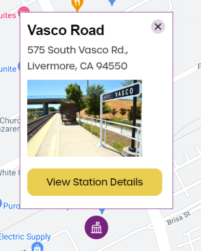
Info windows appear as a Dialog to screen readers. We built this section using specific code as shown below. It shows the station title, address, photos and additional details.
<script src="https://gist.github.com/Ashwin2kPower/835d4918f81866918a387c9808f300cb.js"></script>
Gathering real time data on train arrivals and departures
Using the Google Map API, we made a java script that made regular requests to the backend system to gather the real time location of the trains. We would then use this data to update the markers on the Map and update the time table for arrivals and departures. This helped us design a page that gave real time data to commuters and solve a major pain point for users.
Visually Stunning Design and Usability
We ensured the page was visually appealing and in line with the style guide of the ACE Rail brand. This included font type, size,and color palette. Additionally we introduced a new dropdown menu to identify and filter between westbound and eastbound trains, which helped reduce friction for commuters and streamline their journey.
Summary
Leveraging multiple technology stacks like HTML5, CSS, Javascript and JSON, we were able to redesign the AceRail website to fulfill the needs of first time visitors and regular commuters alike. The beauty of our design solution lies in its simplicity - Easy to use UI, Real time train status, an interactive map with detailed station information and mobile responsiveness that allows commuters to access the website from any device at any time. We were able to build a modern, interactive and user-friendly website for the AceRail authorities that has significantly helped improve user experience.
If you enjoyed this insight, please subscribe to our newsletter below.