Practical guidelines to optimize images for site performance
Introduction
In websites, images that comprise 70% of an average page size can be optimized to improve performance. It can be accomplished by using web resolution images, responsive images, a CDN, etc., Read till the end to learn different methods to optimize images.
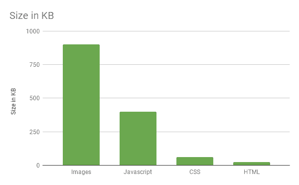
Why optimize images on your site? As as the chart below shows, they are typically the largest contributor to page size and consequently site performance.
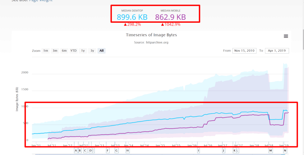
Furthermore, their contribution to page size continues to go up steadily. A typical website these days makes an average of 30 image requests! Page size is usually the single biggest reason for performance degradation.
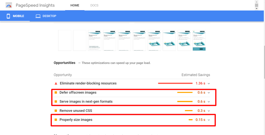
A good place to start testing your site performance and specifically how well your images are doing, is to use Google Pagespeed Insights or use the Lighthouse product within Chrome Dev Tools. You will typically get good feedback like below where you can also see the potential savings in performance:
Use Web Resolution Images
While it is tempting to go with print-quality 300dpi images, resist it. Check your analytics data to see if you get a lot of traffic on Retina displays. If you don’t — which is most likely still the case — then going with a 72dpi image resolution is sufficient, and save you a ton in size.
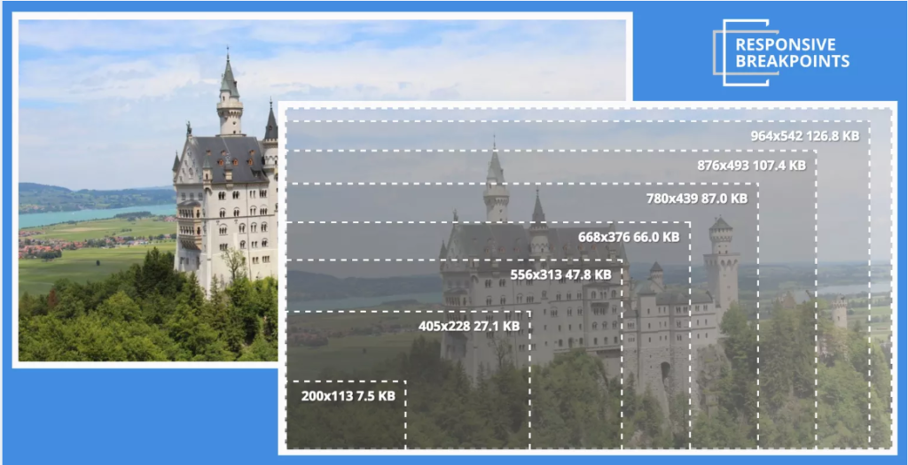
Go with Responsive Images
This is a big one although it might take some more work to setup. The largest image sizes are obviously for the desktops and it is common practice to use them for the mobile and tablet as well. While this is an adequate design practice, try using different images for different viewports. To achieve this, you can use tools like Cloudinary’s responsive image generator that takes the desktop image and generate multiple images optimized for different breakpoints.
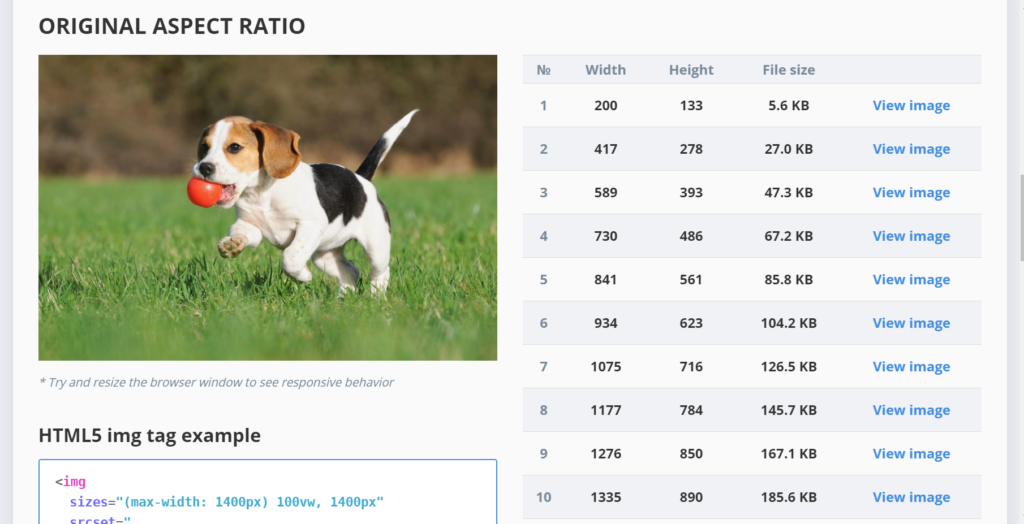
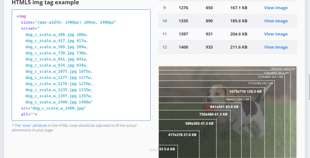
The tool also generates HTML snippet involving srcset that you can embed into your sites for delivering the appropriate image to the user’s browser.
More Advanced Techniques
Image optimization is a vast area, but from a project perspective of timelines and budgets, here are a few other advanced practical tips:
- Use a CDN! This is usually a very powerful solution to speed up your image delivery. There are tons of products and cloud services that can do this for you.
- Use lossy and lossless compression techniques for compressing your images further
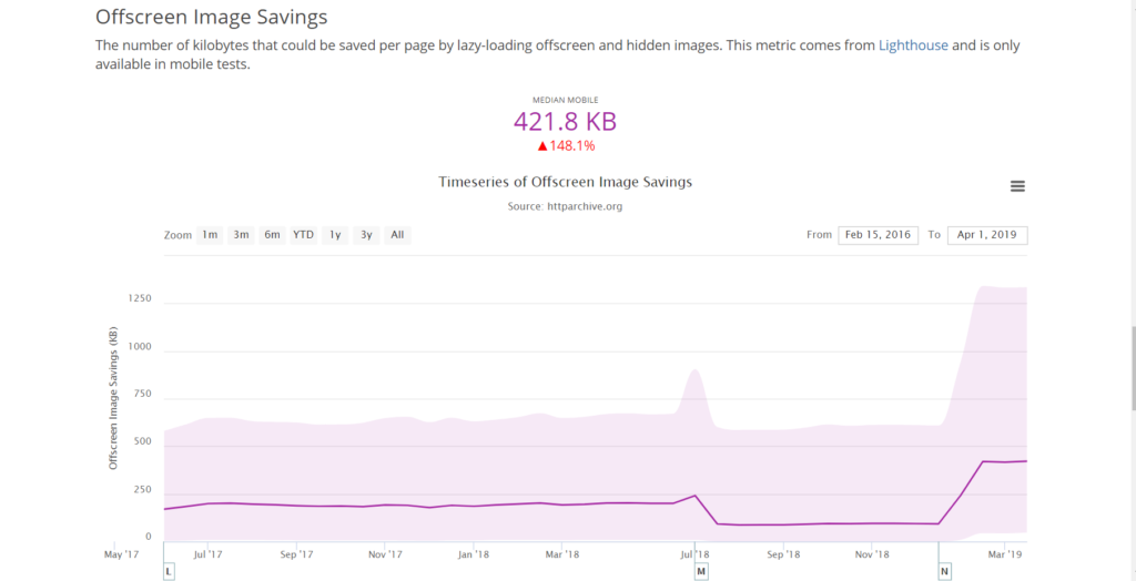
- Use lazy loading and asynchronously load the images that are below-the-fold. That way the user doesn’t have to wait while the hidden part of the page is still loading. Although strictly speaking this is not an image optimization technique, rather a javascript approach — it can be quite powerful. As the chart below shows, a typical page can save on 60% of image load times with this approach.
You can also check out our post on leveraging the toolset provided by Google for broader site performance analysis.