
Introduction to component design for websites
Component-based design thinking is essential to ensure coherence, consistency and productivity when building large websites. We discuss what typical website components look like and how they are organized.
Introduction
Component-based design systems are quite common in product design because they enable consistency, coherence and productivity in large design and engineering teams. Some examples include Salesforce Lightning, IBM Carbon and AirBnB .
Component based design systems are somehow overlooked in websites as they’re one-off builds and don’t have ongoing dedicated teams. They also tend to be quite distinctive and built by outside firms – both of which preclude this sort of rigor. However, with websites getting larger, more sophisticated and critical, this thinking is beginning to change. At the same time, the toolkits are evolving to better support this trend.
In this post, we discuss typical components in a website and how they are organized.
Components in Design
We can derive and outline each component and/or primitives based on generic set of elements that are typically used in web design. Before going in-depth over components let’s talk about how they are formed, how to mix and match and how to create a more consistent style guide within a design.
A good example of a hierarchical way of thinking about design components is Atomic Design. It is a framework to craft thoughtful, consistent, modular and pattern based UI interfaces that are easy to understand and maintain; taking influences from chemical compositions that are formed with atoms, molecules and organic life forms. To further understand applications of this design pattern let’s peek at a Sketch prototype based on this.
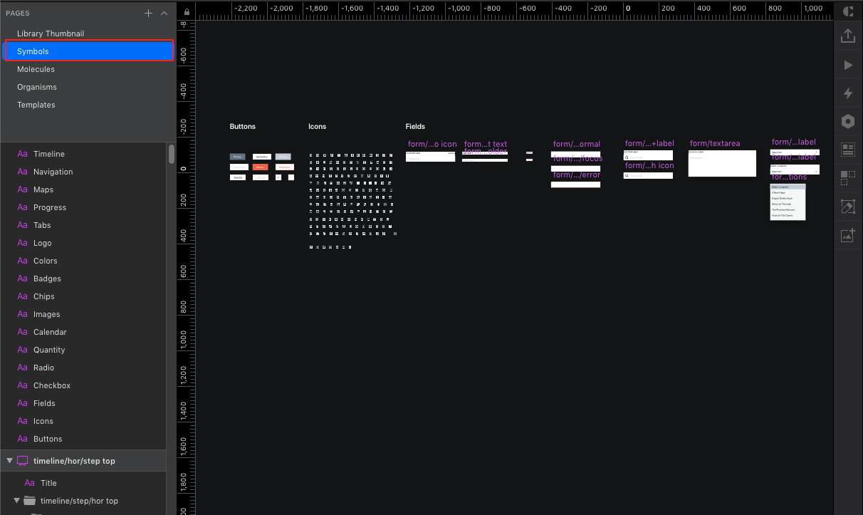
Symbols or Atoms are the smallest units of a design
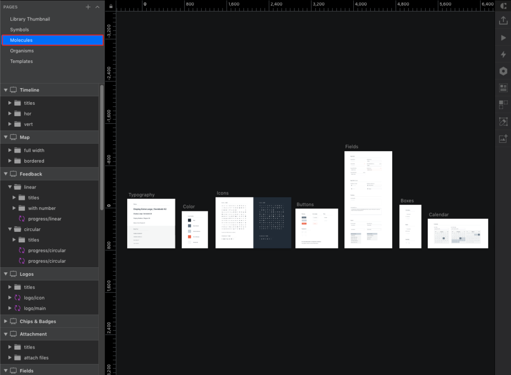
Molecules take shape in form of Typography, Colors, Icons, Buttons etc
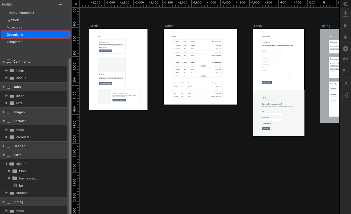
Organisms take shape in form of reusable components
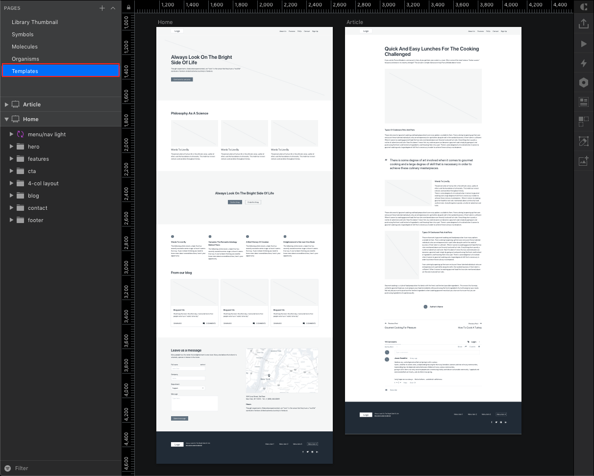
A template finally shapes up comprising atoms, molecules and organisms
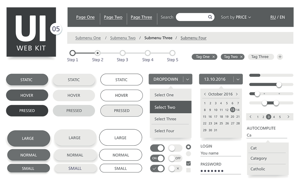
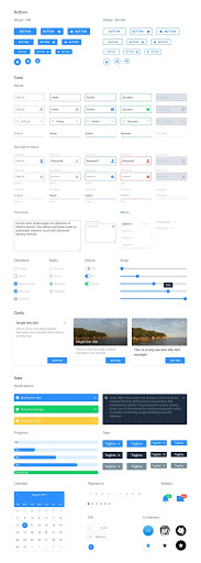
Design level components aka Atoms or Symbols form the very basis of a design. From an atomic design perspective these are formulated atoms, the smallest abstract pieces which will group into a larger design system.
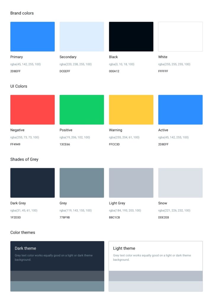
Colors
- Primary
- Secondary
- Tertiary
- Complementary
- Neutrals
- Grays
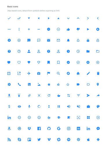
Media
- Icons
- Images
- Videos
- Charts
- Infographics
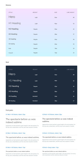
Typography
- Headings
- Paragraph
- Blockquote
- Anchor
- Inline Elements
- Lists
Visual Components
- Button
- Image
- Slider
- Accordion
- Modal
- Hero Units
- Dropdown
- Navigation
- Tooltips
- Switch
- Forms
- Panels
- Datepicker
- Timepicker
Page Components
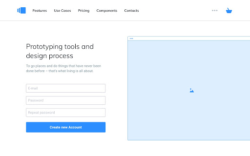
Headers
- Branding
- Navigation Menus
- Contact Information
- Locale Options
- Newsletter Form
- Search
- Social Links
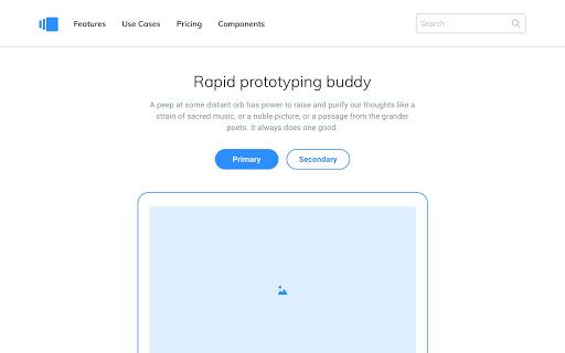
Call to Action/Hero (Above the Fold)
- Product or Service Headline
- Complementary Subheadline
- Hero Media (Image/Video)
- Benefits
- Signup or Newsletter Forms
- Call to Action Button
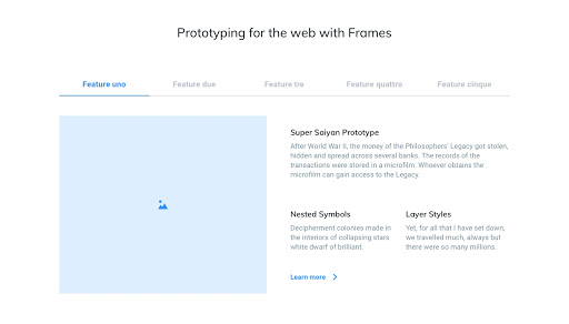
Content (Below the Fold)
- Headline
- Subheadline
- Flagship Products or Services
- Call to Actions
- Features
- Teams
- Testimonials
- Subscriptions
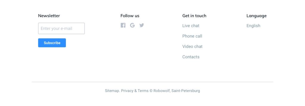
Footer
- Branding
- Important Links
- Social Links
- Newsletter
- Locale Options
- Copyrights
As we mentioned at the outset, component-based design thinking is essential to ensure coherence, consistency and productivity when building large websites. In this post, we discussed what typical website components look like and how they are organized. In the upcoming post, we will discuss how to implement these components in three different CMS products: WordPress, a Headless CMS (Prismic) and Drupal.
Good Reads