
How to do responsive testing efficiently

Introduction
Responsive testing is an important process to ensure the compatibility of a website across various browsers and devices of different screen sizes. Utilizing responsive mode in dev tools and other tools like polypane and browserstack can prove effective compared to resizing the browser windows on devices.
When launching enterprise sites, the team that builds the site tends to have sophisticated toolsets. Their dedicated testing team does thorough responsive testing: multi-device, multi-browser, functional, security, penetration testing, performance testing and such.
This article is focused on clients who lack such sophistication. Besides, they have many other day-day engagements than merely monitoring the site build. They need ways to quickly and efficiently validate the site being built and feel comfortable with the deliverables.
The starting point of course, are the three breakpoints that are agreed-upon. Check out this post for our recommendations regarding the ideal breakpoints for mobile, tablet and desktop.
How Not to Test
There is a great temptation to test by resizing the browser windows on your desktop or laptop. While this is a good start, it is not an effective one. The mechanism that underlies responsive behavior of websites is media queries that manipulate CSS. These vary by many different parameters: viewport width and height, device width and height, landscape-portrait orientation, screen resolution and such. Many sites also leverage javascript frameworks which introduce another level of sophistication. So, using browser resizes to test just does not capture the reality of modern website behavior. Don’t do it!
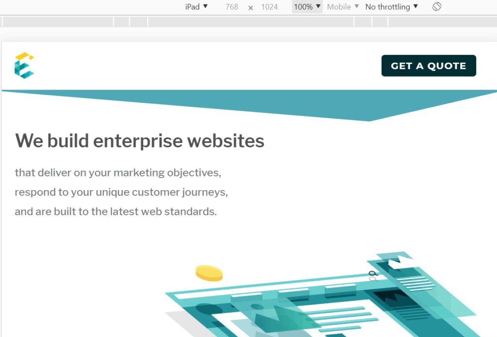
Responsive Mode in Dev Tools
This is the simplest and most effective way to do responsive testing. All modern browsers have a built-in feature called “Dev Tools” that you can launch by right-clicking on the webpage and selecting “Inspect”. You can now begin to look at the site for various mobile, tablet and desktop sizes.

Polypane
While the Dev Tools approach is usually adequate, it is cumbersome because the user has to manually change the viewing options for every page and this can be inefficient. Polypane is a product that reduces this effort. It shows the webpage at all three breakpoints simultaneously and can be quite useful.
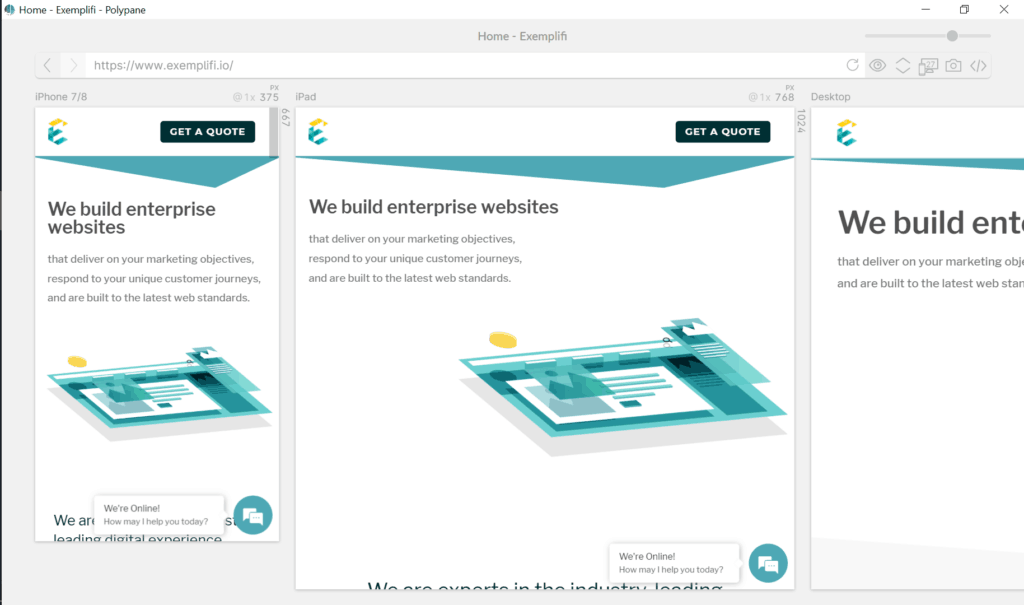
The only downside is that this is a paid product (~ $120/year) but the efficiency gains are quite worthwhile.
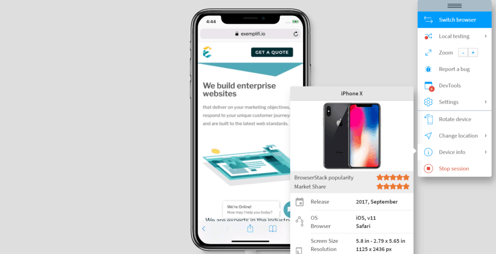
Browserstack
There are several products in the marketplace that “virtualize devices” and Browserstack is a leader in this space. These products work by spinning up a real device in the background and showing the screen of the device in the browser. This ensures that we are seeing the page as it actually rendered on a device — without the hassle of owning multiple devices and switching across them manually.
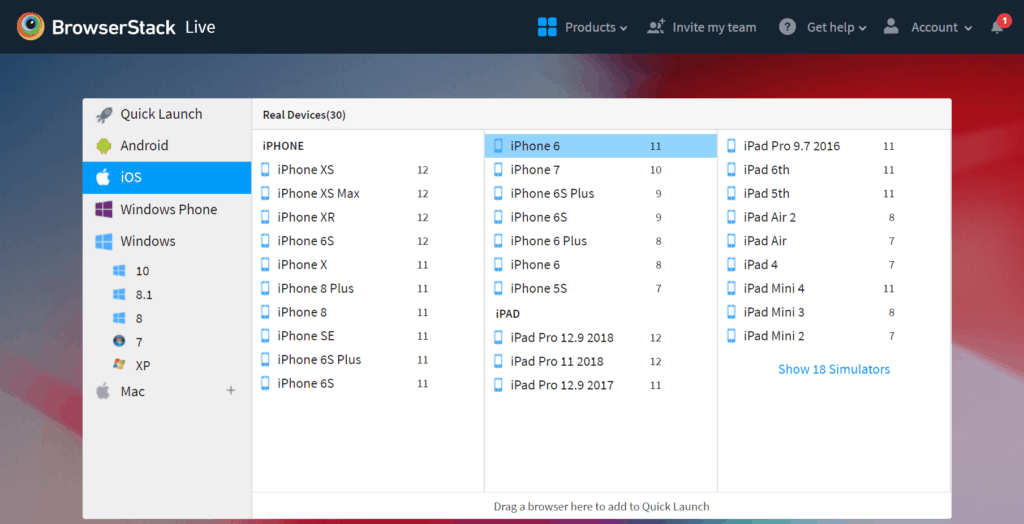
A major advantage of products such as this is that not only can you test responsively on different devices, you can test on different browsers at the same time. Depending on the rigor you want to introduce into your testing, this product can be a massive efficiency gain. Prices range from $100/month to enterprise packages in the range of $K/month.
Real Devices
Toolsets such as the ones described earlier are quite robust and there are very few reasons to test on real devices these days. A few exceptions would be if your site utilizes javascript heavily or is animation-intensive. Obviously this approach would be hugely cumbersome and a recommendation we would make is to focus the testing on device sizes (mobile/tablet/small desktop/large desktop) rather than browsers. We say this because all modern browsers – Chrome, Firefox, Safari, Edge — deliver a relatively consistent experience these days.