
How to Display WordPress Posts in a dynamic grid layout
Introduction
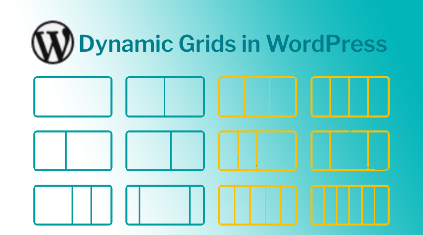
This article describes creating a dynamic grid layout for WordPress posts using custom post types, CSS Grid, and jQuery for animations. Setting up a responsive design that adapts to different screen sizes, with interactive elements like expandable tabs are detailed out. Read further to learn more.
The Challenge
As part of our work for Acerail, a railway organization in the state of California, we had to create a dynamic expanding accordion with grid items to showcase the stations they serve. This was implemented on a Wordpress website, and the stations' data needed to be updated dynamically. Additionally, we were tasked with enhancing the user experience by implementing specific interactions to make the design more interactive. Below is a screenshot of the Figma design that was provided to us by our designer.
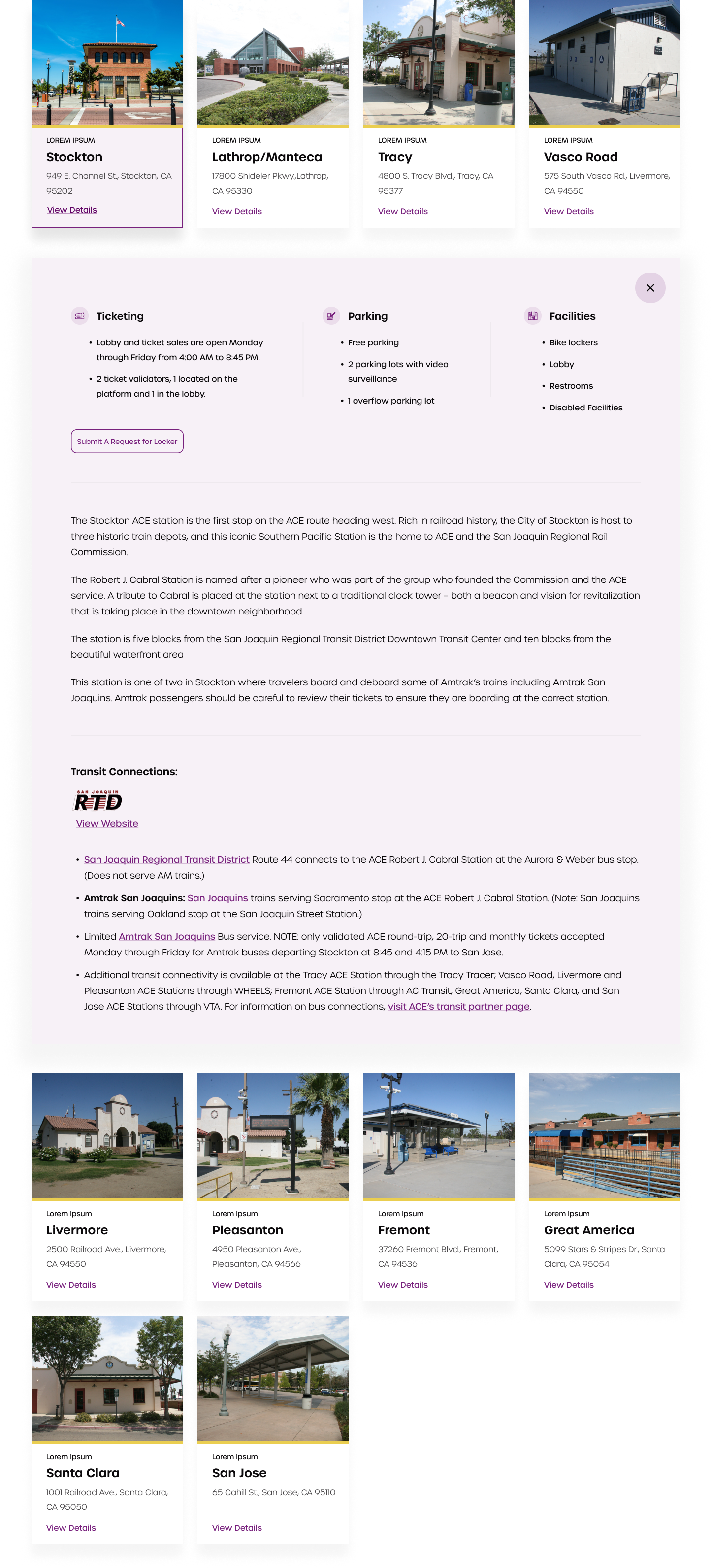
From the outset, we encountered several challenges. The responsive grid had varying numbers of columns on different screen sizes, and the expanding panel needed to move to the next row regardless of the number of items in the grid. Achieving this presented a significant difficulty.
The Architecture
The website is built using the latest version of WordPress. To make our data dynamic and easily accessible via WordPress, the most efficient approach would be to develop a custom post type and associated custom fields.
To display all our posts in a grid layout with each item's content within a div, we will need to find an effective way to loop through the posts and display the content, given that we're using Beaver Builder on our page. Adding custom classes and data attributes to facilitate scripting would be necessary.
To streamline the process, we decided to create a shortcode that would render the grid with all the desired content, making it easily usable anywhere on the site.
After conducting extensive research, we ultimately opted to utilize the CSS grid property. This allowed us to arrange the individual clickable stations within a grid, with the corresponding tab for each station added after the respective element. Using the CSS grid order property, we were able to position the tab after the end of the row.
Initially, the tab will be hidden, and only revealed when a user clicks on the corresponding station. The tab's height will smoothly expand to avoid causing distractions for the user. Once revealed, the tab will become part of the grid. We will need to use jQuery to reorder it after the last element in that row to ensure proper alignment with the current row.
Fetching our Stations
So let’s get into some code. Here’s the shortcode we created to loop through the posts and create our grid.
| <?php | |
| function stations_shotcode() | |
| { | |
| $sargs = array( | |
| 'post_type' => 'stations', | |
| 'posts_per_page' => '10', | |
| 'publish_status' => 'published', | |
| ); | |
| $q_stations = new WP_Query($sargs); | |
| $stations .= '<div class="acerail-stations-container">'; | |
| if ($q_stations->have_posts()): | |
| while ($q_stations->have_posts()): | |
| $q_stations->the_post(); | |
| $feature_img = get_the_post_thumbnail_url(); | |
| if (have_rows('station_options')): | |
| while (have_rows('station_options')): | |
| the_row(); | |
| $sub_title = get_sub_field('sub_title'); | |
| $location = get_sub_field('location'); | |
| $ticketing = get_sub_field('ticketing'); | |
| $parking = get_sub_field('parking'); | |
| $facilities = get_sub_field('facilities'); | |
| $descriptions = get_sub_field('descriptions'); | |
| $transit_connections = get_sub_field('transit_connections'); | |
| $stations .= '<a href="#' . get_the_ID() . '" class="acerail-stations" data-id="' . get_the_ID() . '">'; | |
| $stations .= '<div class="item-image" style="background-image: url(' . $feature_img . ')"></div>'; | |
| $stations .= '<div class="station-content">'; | |
| $stations .= '<p class="sub-title">' . $sub_title . '</p>'; | |
| $stations .= '<h6>' . get_the_title() . '</h6>'; | |
| $stations .= '<p class="location">' . $location . '</p>'; | |
| $stations .= '<p class="details">View Details</p>'; | |
| $stations .= '</div>'; | |
| $stations .= '</a>'; | |
| $stations .= '<div class="station-description hidden" data-id="' . get_the_ID() . '">'; | |
| $stations .= '<button type="button" class="close-btn">'; | |
| $stations .= '<img src="/wp-content/uploads/close.svg" />'; | |
| $stations .= '</button>'; | |
| $stations .= '<div class="columns">'; | |
| if ($ticketing): | |
| $stations .= '<div class="ticketing">'; | |
| $stations .= '<h3>Ticketing</h3>'; | |
| $stations .= $ticketing; | |
| $stations .= '</div>'; | |
| endif; | |
| if ($parking): | |
| $stations .= '<div class="parking">'; | |
| $stations .= '<h3>Parking</h3>'; | |
| $stations .= $parking; | |
| $stations .= '</div>'; | |
| endif; | |
| if ($facilities): | |
| $stations .= '<div class="facilities">'; | |
| $stations .= '<h3>Facilities</h3>'; | |
| $stations .= $facilities; | |
| $stations .= '</div>'; | |
| endif; | |
| $stations .= '</div>'; | |
| $stations .= '<a href="#" class="request-btn">Submit A Request for Locker</a>'; | |
| if ($descriptions): | |
| $stations .= '<div class="descriptions">'; | |
| $stations .= $descriptions; | |
| $stations .= '</div>'; | |
| endif; | |
| if ($transit_connections): | |
| $stations .= '<div class="transit_connections">'; | |
| $stations .= '<p>Transit Connections:</p>'; | |
| $stations .= $transit_connections; | |
| $stations .= '</div>'; | |
| endif; | |
| $stations .= '</div>'; | |
| endwhile; | |
| endif; | |
| endwhile; | |
| endif; | |
| $stations .= '</div>'; | |
| wp_reset_postdata(); | |
| return $stations; | |
| } | |
| add_shortcode('stations', 'stations_shotcode'); |
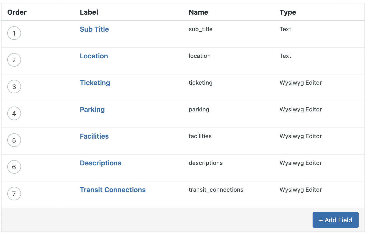
As you can see there are multiple custom fields for our data. We will pull them in individually and create our structure accordingly.
There is an outer container to which we will attach the grid property. There are anchor links with minimal station data which on click will reveal the container just adjacent to it with the rest of the content. This shortcode [stations] is then inserted into our beaver builder container on the Stations page. Once we have all the data on the page the next step is to style it and create our interactions.
Styling the Grid
Firstly we need to create a grid. The outer container will need values based on our breakpoints to display variable columns on different screen sizes. On smaller screen sizes we shall omit the grid property as all the content will be one below the other.
| @media (min-width: 1200px) { | |
| .acerail-stations-container { | |
| grid-template-columns: repeat(4,minmax(0,1fr)); | |
| } | |
| } | |
| @media (min-width: 1024px) { | |
| .acerail-stations-container { | |
| grid-template-columns: repeat(3,minmax(0,1fr)); | |
| } | |
| } | |
| @media (min-width: 640px) { | |
| .acerail-stations-container { | |
| display: grid; | |
| grid-template-columns: repeat(2,minmax(0,1fr)); | |
| } | |
| } | |
| .acerail-stations-container { | |
| -moz-column-gap: 1rem; | |
| column-gap: 1rem; | |
| } |
The grid item has some hover effects and will have an active representation. Let’s add a class to show our active styles.
| .acerail-stations-container .acerail-stations { | |
| margin-bottom: 1rem; | |
| display: block; | |
| border-width: 2px; | |
| border-style: solid; | |
| border-color: transparent; | |
| transition-property: all; | |
| transition-timing-function: cubic-bezier(.4,0,.2,1); | |
| transition-duration: .7s; | |
| box-shadow: 0 24px 24px #0000000a; | |
| } | |
| .acerail-stations-container .acerail-stations:hover, .acerail-stations-container .acerail-stations.open { | |
| border-width: 2px; | |
| border-style: solid; | |
| border-color: rgb(120, 33, 125); | |
| } |
Secondly the tab will have to be set to full width. Changing the order now would not be possible using css. We shall use jQuery to calculate the order in the next step.
We needed to refine the sliding animation, and after some research, we found a solution that leverages CSS transitions. Firstly, we had to remove the top and bottom padding to set the tab's max-height to 0px initially. Using jQuery, we can add an "expand" class to the tab, which sets its max-height to 1200px. To ensure a smooth transition, we added a duration of 700 milliseconds.
| .acerail-stations-container .station-description { | |
| position: relative; | |
| margin-bottom: 0; | |
| box-sizing: border-box; | |
| max-height: 0px; | |
| overflow: hidden; | |
| background-color: #f1e9f299; | |
| padding-left: 3rem; | |
| padding-right: 3rem; | |
| padding-top: 0; | |
| padding-bottom: 0; | |
| transition-property: all; | |
| transition-timing-function: cubic-bezier(.4,0,.2,1); | |
| transition-duration: .7s; | |
| } | |
| .acerail-stations-container .station-description.expand { | |
| margin-bottom: 1rem; | |
| max-height: 1200px; | |
| } |
Now grid items are not assigned orders organically. We’ll loop through the links and assign them orders manually so that the tab can order itself perfectly.
| // Set order | |
| $(".acerail-stations").each(function (i) { | |
| $(this).css({ order: i + 1 }); | |
| }); |
So there are a bunch of things that need to happen once the link is clicked. Let’s go through each. Firstly we need to add an active class to the link itself. Before unhiding the tab we need to set its order so it doesn’t break our design. We can then unhide it. We’ve already set its height to 0 so there will be no movement. After a tiny timeout we shall add the “expand” class. With transitions enabled the tab should slide open smoothly.
| // Station click function | |
| $(".acerail-stations").click(function (e) { | |
| e.preventDefault(); | |
| _this = this; | |
| if (!$(this).hasClass("open")) { | |
| window.location.hash = $(this).data("id"); | |
| if ($(".acerail-stations.open").length) { | |
| // If a tab is open | |
| $(".acerail-stations.open").removeClass("open"); | |
| $(this).addClass("open"); | |
| var expand = $(".station-description.expand"); | |
| $(expand).removeClass("expand"); | |
| setTimeout(() => $(expand).addClass("hidden"), 700); | |
| setOrder(this); | |
| $(this).next().removeClass("hidden"); | |
| setTimeout(() => $(_this).next().addClass("expand"), 100); | |
| } else { | |
| // If all tabs closed | |
| $(this).addClass("open"); | |
| setOrder(this); | |
| $(this).next().removeClass("hidden"); | |
| setTimeout(() => $(_this).next().addClass("expand"), 100); | |
| } | |
| } | |
| }); |
Now if a tab is open, we will first need to close it and hide it so it doesn’t mess with our grid order. Also we need to wait for this animation to complete before opening our next tab. To speed up the process we can close and open the two tabs simultaneously. That’s what the second condition is for.
There are a few things more to be done. Firstly as you noticed we are changing the hash on opening the accordion. This hash is the post id, which will be unique for each Station. On page load, we can then scroll to the selected element and open the tab. Below is the code to do that.
| // Open accordion in hash | |
| if (window.location.hash) { | |
| var selected = $( | |
| '.acerail-stations[data-id="' + window.location.hash.substring(1) + '"]' | |
| ); | |
| $("html, body").animate( | |
| { | |
| scrollTop: parseInt($(selected).offset().top) - 15, | |
| }, | |
| 300, | |
| function () { | |
| $(selected).addClass("open"); | |
| setOrder(selected); | |
| $(selected).next().removeClass("hidden"); | |
| setTimeout(() => $(selected).next().addClass("expand"), 100); | |
| } | |
| ); | |
| } |
There’s also a close button on the tab. We shall animate and hide the tab when it is clicked and then also remove the hash from the url.
| // Station accordion close btn | |
| $(".station-description .close-btn").click(function (e) { | |
| e.preventDefault(); | |
| window.location.hash = " "; | |
| $(".acerail-stations.open").removeClass("open"); | |
| var expand = $(".station-description.expand"); | |
| $(expand).removeClass("expand"); | |
| setTimeout(() => $(expand).addClass("hidden"), 700); | |
| }); |
Lastly, if a tab is open, and the viewport’s dimensions change, the order for our tab will be incorrect. So we write a small script to reorder an open tab on window resize.
| // Re-set order on resize | |
| $(window).resize(function () { | |
| setOrder($(".acerail-stations.open")); | |
| }); |
Summary
So there it is. To sum up, we have successfully imported our station data from the custom post type and created a responsive grid structure. We also utilized jQuery to animate the tabs. Our responsive grid accordion is now complete. Thank you for reading this far and if you enjoyed this post feel free to follow us for more weekly insights.