
Building User-friendly digital solutions for the transportation industry
Introduction
This article outlines creating user-friendly digital solutions for the transportation industry which highlights the design and implementation of a real-time train schedule feature on the header of the homepage, using custom dropdowns and dynamic data integration to enhance the user-experience. Read further to dive deep into the transit solution and the step-by-step process of implementing it.
Acerail
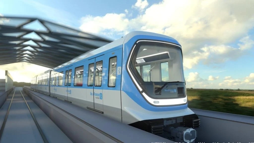
Altamont Commuter Express (ACE) is a regional commuter rail service connecting Stockton and San Jose in Northern California. It offers comfortable trains, convenient schedules, and amenities like Wi-Fi. ACE provides a sustainable and efficient transportation option for commuters traveling between the Central Valley and the Bay Area, with connections to other modes of transportation.
ACE operates trains on weekdays, with limited service available on weekends for special events. The trains generally offer morning and evening commute options, aligning with typical work hours. The frequency of trains varies depending on the specific route and time of day.
It serves as a vital transportation link for commuters in Northern California, providing an efficient and sustainable option for traveling between the Central Valley and the San Francisco Bay Area.
The Design Problem
To cater to the needs of daily commuters visiting the homepage, our focus was to provide an exceptionally fast and efficient experience where they could instantly view the next available train to catch. The goal was to enable users to quickly select their station and see the estimated arrival time of the train. Additionally, it was important to offer the option for users to select a destination and see when the train would arrive at that specific location.
Understanding the time constraints of harried commuters, we implemented this experience right in the main hero unit of the homepage, ensuring that users didn't need to scroll or navigate through the website to access this crucial information. By placing it prominently and streamlining the interaction, we aimed to deliver a seamless and ultra-quick experience that allowed commuters to effortlessly access the train schedule information they needed for their daily journeys.
The Design Solution
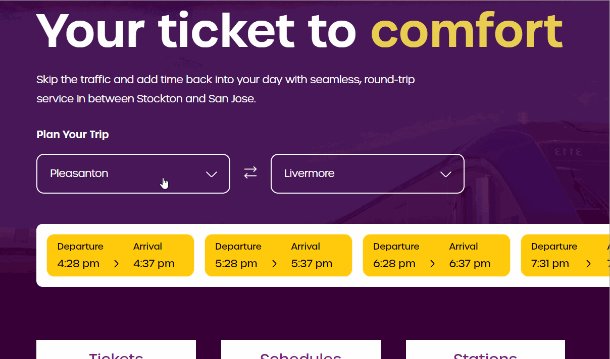
We built a solution that focused on ease of use for first time commuters and daily travelers. Here's a peek at what we created -
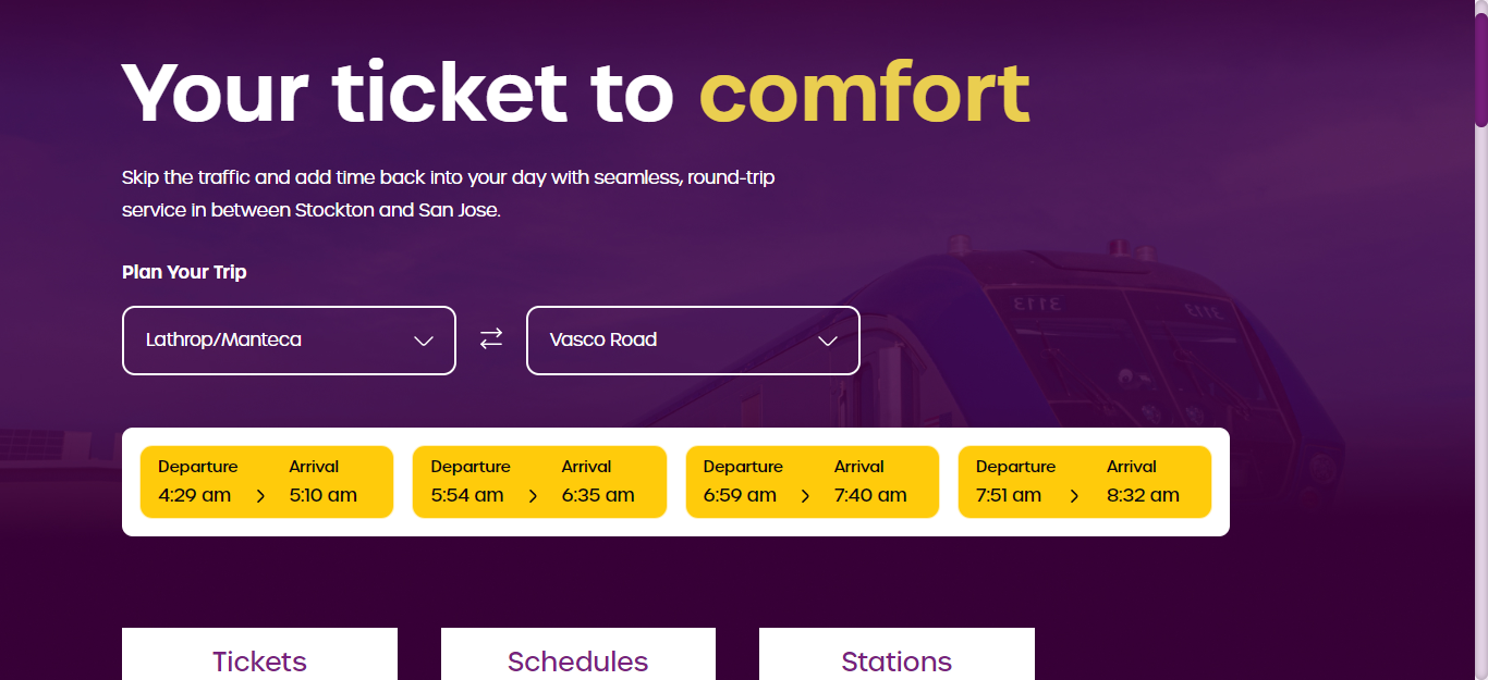
We built and integrated this module to the header section which led to a sleek and improved user interface and experience. Commuters could now instinctively identify the train schedules, timings, start and end stations etc. Our primary aim was to make the information regarding the next available train instantly visible as the users access the site with a fast and efficient way to absorb crucial train schedule information and easily plan their journeys.
How We Implemented The Solution
Station Selector
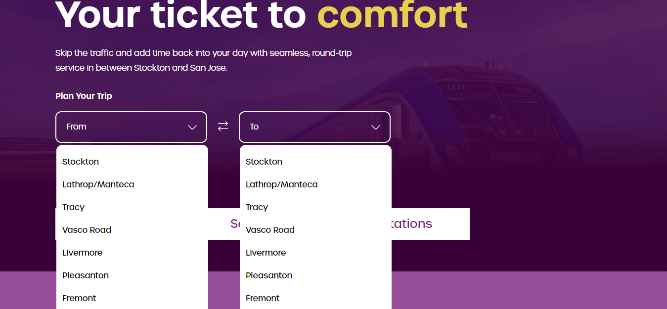
The design solution required us to build a custom dropdown. For that, we needed all the station data in a list within our front end.
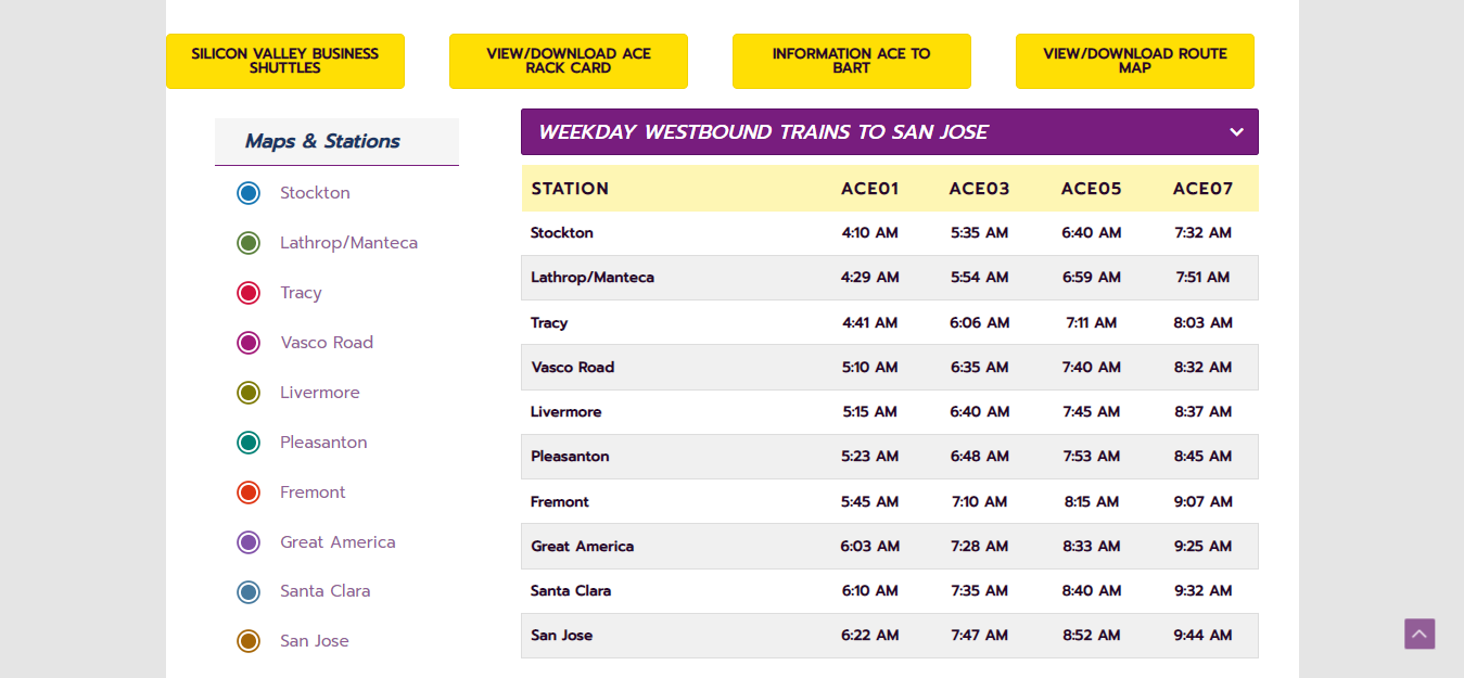
All the station data like the name, order, and timings were available on a custom post type which we called “Station”. The easiest way to pull this data and create a list would be to create a shortcode. We ended up creating a simple shortcode to loop through the Station post type, collecting all the names in the correct order as a list. The timings were then added to the individual list items.
As you can see in the above code. We create an argument to loop through the stations, add all the timings as attribute values onto the list item and finally append it to a wrapper that can be appended anywhere on our site with a shortcode.
With a bit of styling the list was positioned below the dropdown element and hidden. We then added scripts to show/hide the menu on the user’s click.
With some more functions, we then check if both from and to dropdowns are selected. When that happens, we pull the timings from the data attributes already attached to the list item for that station. The table with the times is then added to our front end with a bit of styling to make it look like our design.
The last bit of effort was the reverse button, which simply reverses the to and from selections and executes the same script to calculate the times.
Real-time Data Integration
All the data in this section is being pulled from the Station post type. The timings are entered on the WordPress backend and are completely dynamic. Upon changing any of the data, it immediately reflects on the front end.
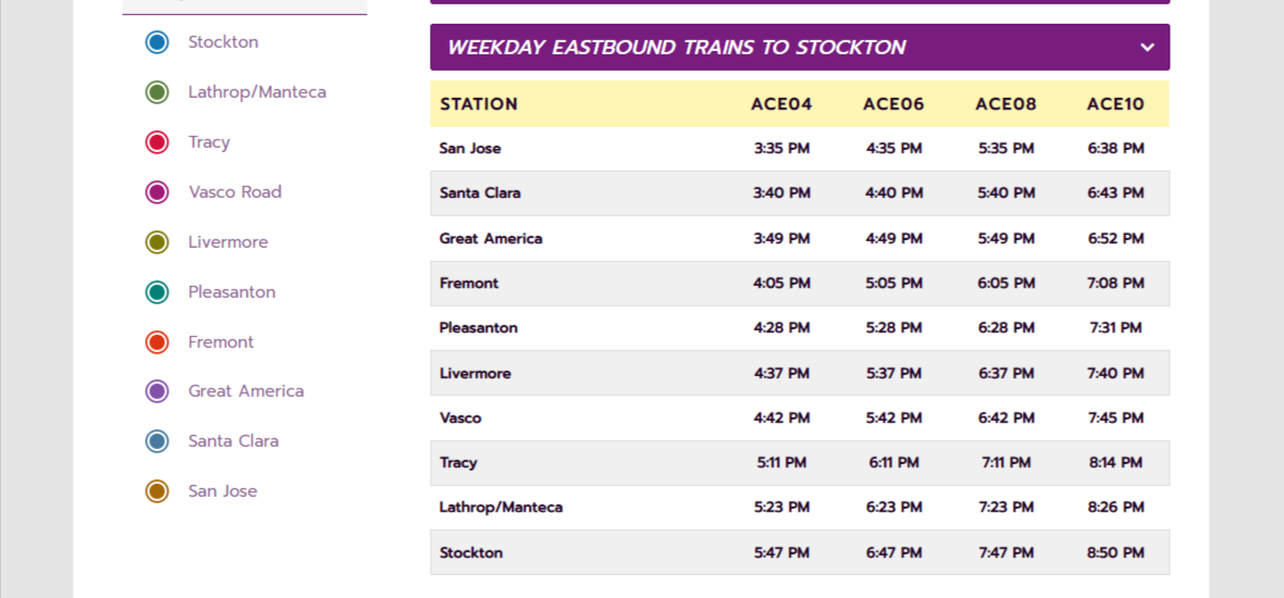
The custom field Order accepts numerical entries which then specify the order of the stations. The name states the name which will be displayed on the dropdown. Finally, the timings for each station in both directions have to be entered into separate custom fields created for this purpose.
The shortcode is executed every time the user lands on the page, pulling in the most recent data from the WordPress API and then displaying them when the user selects the dropdown.
Dynamic Content Display
We already had the jQuery library present on our front end to achieve the goal of dynamic content display. The dropdown functions were added using simple jQuery commands. Here is the script.
The script adds a click listener on the dropdown button and opens the dropdown on click. It also detects when both dropdowns are selected and then executes the showTimings functions which creates a container with the timings and appends it below the dropdown. A few styles to smoothen the entry and we are good to go.
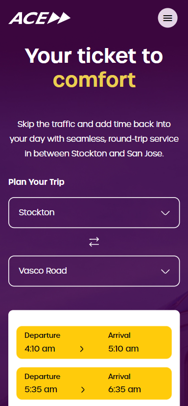
Responsive Design
Making sure that the design is responsive and functions well on various devices and screen sizes. This is especially important as commuters might access the site on various devices while on the go. A few steps were needed to make the dropdown responsive.
With the help of media queries, we brought the dropdowns below each other on mobile. The timings section also had to be formatted for mobile. Instead of being one beside the other, they were arranged one below the other on slimmer devices; again with the help of media queries.
Testing and Deployment
Testing the implemented solution thoroughly to ensure everything works as expected was the final step in the process. One of the key challenges was ensuring that when selecting specific stations in the “From ” and “To” drop-down menus, the planner displays related timings within the specific time period. This required us to rigorously test every combination of stations and timelines to make sure everything worked and nothing was broken.
Furthermore, when changing the stations, the displayed time should update accordingly.
During device testing, our main focus was on the user interface(UI) and functionality to verify if all elements are correctly displayed on the screen. We particularly examined whether the selection of stations from the drop-down menus resulted in the display of related timings. We were able to achieve this and ensure it worked across the most used devices and resolutions. Here’s how it looks in the latest iPhone
Summary
In order to deliver a seamless user experience to the commuters of ACERail, we had multiple design challenges to overcome. Using JQuery and some sophisticated solutions, we were able to completely revamp the ACERail digital experience by creating an easy to navigate train schedules page. This included dropdowns that were WCAG compliant, easy to use and quick to load, Real time data fetching that helped users get exact arrival / departures times about their trains, which helped them plan their entire journey, improve website speed and performance while maintaining the comforting brand aesthetics of ACERail. All in all, we were able to build a User-friendly digital solution for the transportation industry in record time, and now so can you.