
Building a real-time data visualization solution for geodata
Introduction
Big Data and geodata have been a few of the biggest game-changers in the last decade. Both of these new technological revelations have changed the face of analytics, marketing, transportation, and every other field imaginable. Big data and Geodata are built on the foundation of raw information which is eventually channeled and utilized to help make informed decisions. In this article, we deep dive into melding Geodata with Big Data through data visualization, to help provide a location aware data solution. This is a tech-heavy article, so get your dev environments ready!
Data visualization brings to life information architecture in the age of big data, sketched with interactive graphic elements like charts, graphs, maps, and topologies. Common visualizations are Line, Bar, Pie, Doughnut, Scatter, Area, and Polar charts, something quite reminiscent of Excel spreadsheets. When it comes to web browsers, HTML5 features like Canvas, SVG, WebGL, and data-driven document modeling (known as D3) are prevalent. The feature that is the most challenging and fun to work with is complex GIS-based maps to project a topological or geographic landscape.
How it all started
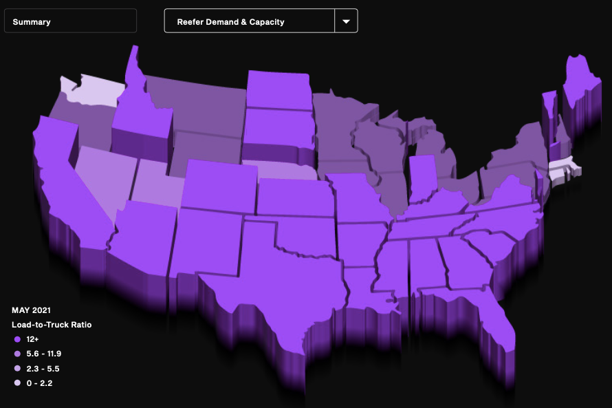
One of our clients – DAT (a leader in freight & analytics), wanted to improve their existing freight analytics in a way that was easy to consume and would provide maximum insight at a quick glance. This is where Exemplifi, decided on the idea of building an innovative and leading-edge dashboard for multiple visualizations of their raw data. With this intention, we explored - advanced charting and Geo maps utilizing HTML5 data-driven documents. Crunching and munching over the initial revamp drafts, we came up with our first concrete solutions below:
Building the Speedometer
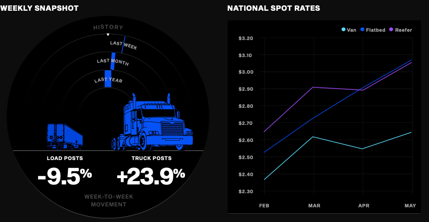
Since we were building a visualization solution for a freight company, we decided to create something that matched their industry aesthetics. Hence we decided on the speedometer which sits at the heart of real-time freight analytics. It provides a dashboard with WoW (weekly), MoM (monthly), and YoY (yearly) loads and truck progression for each freight fleet. The gauges animate dynamically showing the current readings once the page is fully loaded, while the gauge data is fetched from the DAT API endpoints in real-time.
One way we could have gone about it was plain SVG with groups and layers of the instrument cluster with pure CSS3 blended with parts of SVG. But keeping in mind that we want to deliver insights at lighting speed to users, we chose to prioritize responsiveness, and hence the speedometer implementation was divided into [divs] with absolute positioning. It turned out something like this:
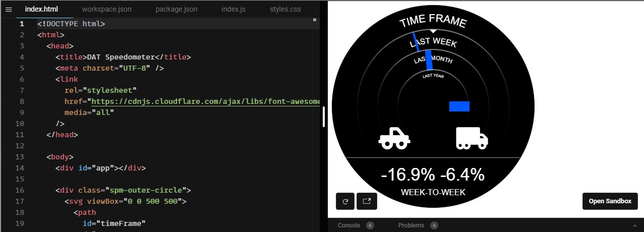
Looking into this prototype closely, the [div.spm-outer-circle] renders dark background circle with [border-radius: 100%; min-width: 320px; min-height: 400px] which is enough to create a radial background effect. Within the background are 3 SVG path elements that are used to render text labels (Timeframe, Last Week, Last Month, and Last Year) around that path using textPath SVG element. These paths are nothing but transparent semicircles layered on top of each other.
The gauge bars are then added as [<span class="bar w-t-w"></span>] elements with absolute positioning which move dynamically with animation. Moving the gauges around the radius of semicircles was achieved using CSS3 translateX and rotate properties that give animated effect with CSS3 transition setting. How far the gauges move is entirely dependent on API response data. Two more interactions are handled, one for hover on the bar to show YoY values, and bar click to change bottom labels, all of which are managed with jQuery.
Building the Charts and Maps
Based on the Speedometer, we sampled a few chart prototypes with D3. Being an industry leader in enterprise websites, we went one step ahead to test prototypes on ChartJS as well, which was a more refined alternate for charts in contrast to building a native chart from scratch with D3. The decision of going ahead with ChartJS panned out quite well – initially:
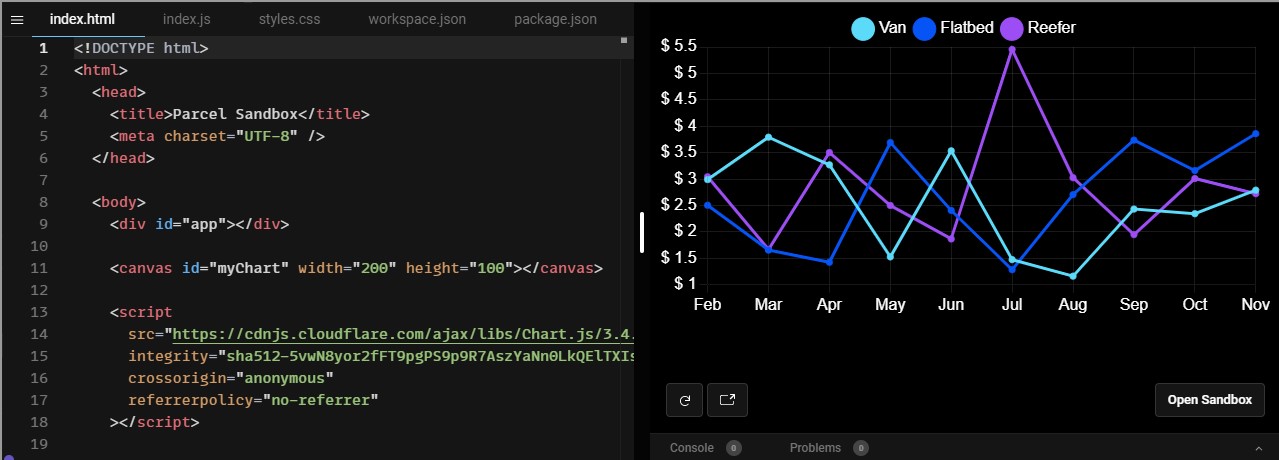
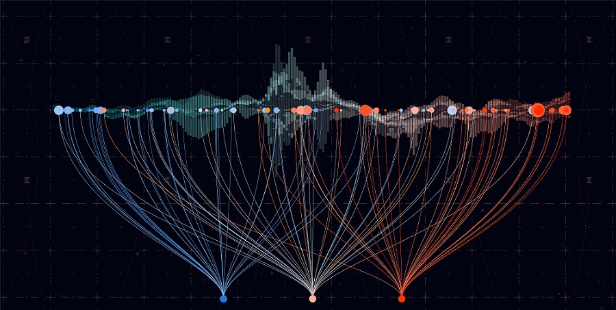
With a bit of styling and refined datasets, ChartJS was the go-to library for charts. This oversimplification expanded into a tricky affair with visualizing topological Geo charts! Hence, we decided to roll back to D3 for the sheer amount of data and interactions involved.
ChartJS not only required a deeper understanding of how a GIS device works but also took serious code work on how GeoJSON and TopoJSON could fully render an interactive SVG map based on GeoJSON or TopoJSON objects. Hypothetically a GeoJSON file could be read by most GIS devices, but when it comes to the alternative, D3 pairs well with TopoJSON which works on top of GeoJSON (when converted/simplified to TopoJSON).
Melding GeoJSON and TopoJSON with D3
GeoJSON is an open standard for representing geographic information in a JSON file. Its usage is common among sharing Geo data across web services or manipulating vector data in a browser. A GeoJSON file consists of either a FeatureCollection or a single Feature object. GeoJSON incorporates six basic types of geometry: Point, LineString, Polygon, MultiPoint, MultiLineString, MultiPolygon, while a composite of this geometry defines a complete topological construct of a map.
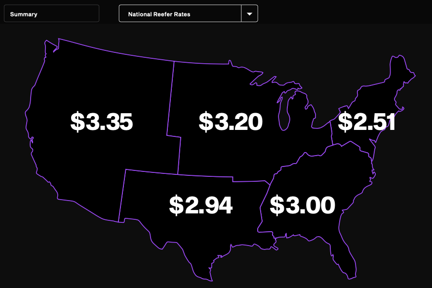
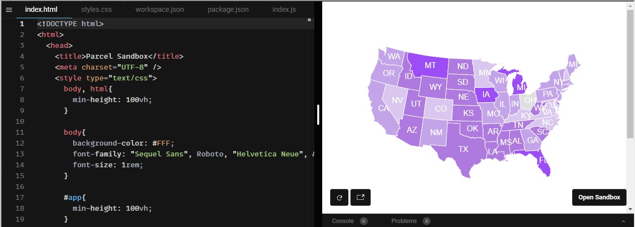
TopoJSON is an extension of GeoJSON to simplify paths as arcs, thereby reducing redundant data across topological boundaries, and reducing duplicates, resulting in a bandwidth savvy payload. When married to D3, you could render a hi-res SVG map of US like below (based on TopoJSON):
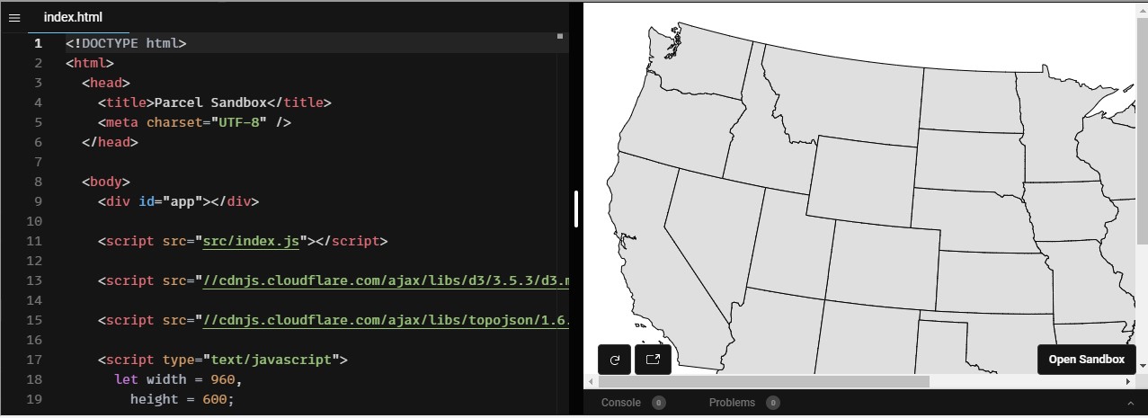
In the above map, D3 parses [./src/us.json] return Feature objects or collection of Features using the [topojson.feature()] function that define each states topological geometry. D3 just needs this Feature information to render each state into SVG paths. Inside the us.json file you’ll also find counties, and with one quick change, you could render entire US counties instead of states. As exciting as it looked, it required about 25-30 lines of code to render states without any interactions. To achieve labels, tooltips, legends, and mouse interactions was a whole different mountain to climb.
Luckily, D3 and TopoJSON had a close kinsman, DataMaps - which can render SVG map visualizations using D3 in a single Javascript file. The feature sets matched closely with what we were looking for -- a bare-bones library that worked well with D3/TopoJSON while offering interaction with labels, tooltips, and legends based on datasets. DataMaps could render predefined maps all of which are bundled in one file or it could render from a custom map, with a valid TopoJSON file. With a few trials and errors, we were able to incorporate multiple datasets to help build more insights into our map.
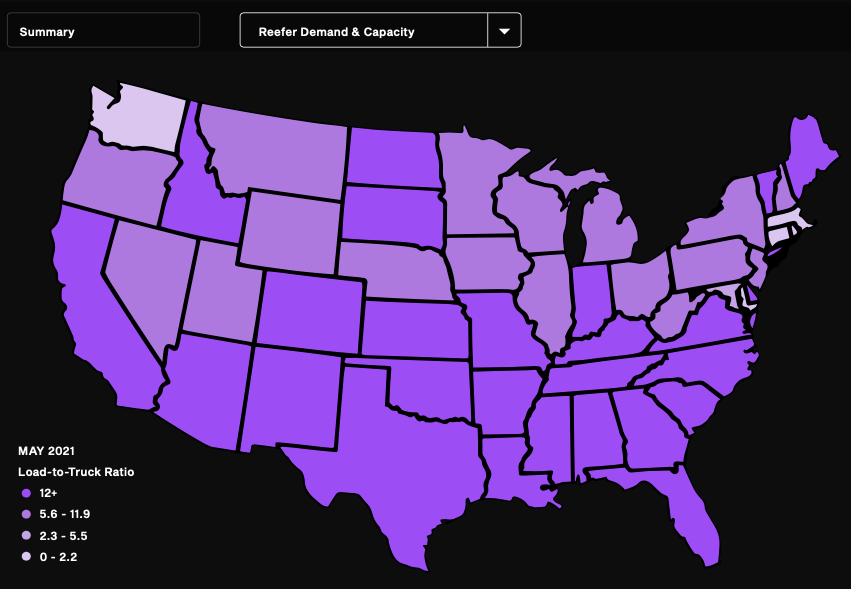
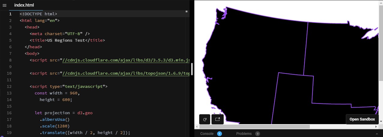
Building the US map, state by state with Advance Cartography through TopoJSON
Creating state-wise maps was fairly straightforward with DataMaps, but creating region-wise maps was a whole different ball game. We decided to go ahead with a mix of D3/TopoJSON. In the end, it boiled down to merging state boundaries to create unified regions of the map – Northwest, Midwest, Southwest, Southeast, and Northeast.
We started by abstracting the core GeoJSON definition of the postal abbreviations and relevant FIPS codes of US states. These were then paired with the key = value objects for a lookup variable. Then we starting defining regions object which contains the postal abbreviations forming a region. As mentioned earlier, a TopoJSON object already contains all US states and counties along with their identifiers (postal abbreviations). Based on these two filter criteria we defined the following:
const lookup = {
"53": "WA",
"41": "OR",
"6": "CA",
"16": "ID",
"30": "MT",
"56": "WY",
"32": "NV",
"4": "AZ",
"49": "UT",
"38": "ND",
"46": "SD",
"31": "NE",
"20": "KS",
"27": "MN",
"55": "WI",
"26": "MI",
"19": "IA",
"29": "MO",
"17": "IL",
"18": "IN",
"39": "OH",
"21": "KY",
"8": "CO",
"35": "NM",
"48": "TX",
"40": "OK",
"5": "AR",
"22": "LA",
"47": "TN",
"28": "MS",
"1": "AL",
"12": "FL",
"13": "GA",
"45": "SC",
"37": "NC",
"51": "VA",
"54": "WV",
"42": "PA",
"24": "MD",
"10": "DE",
"34": "NJ",
"36": "NY",
"25": "MA",
"9": "CT",
"44": "RI",
"50": "VT",
"33": "NH",
"23": "ME",
}
const regions = [
{
"name": "northwest",
"contains": ["WA", "OR", "CA", "ID", "MT", "WY", "NV", "AZ", "UT"]
},
{
"name": "midwest",
"contains": ["ND", "SD", "NE", "KS", "MN", "WI", "MI", "IA", "MO", "IL", "IN", "OH", "KY"]
},
{
"name": "southwest",
"contains": ["CO", "NM", "TX", "OK", "AR", "LA"]
},
{
"name": "southeast",
"contains": ["TN", "MS", "AL", "FL", "GA", "SC", "NC"]
},
{
"name": "northeast",
"contains": ["VA", "WV", "PA", "MD", "DE", "DJ", "NY", "MA", "CT", "RI", "VT", "NH", "ME"]
}
];
Once these filter variables were in place it was time to roll out D3 on the canvas. Since D3’s Geo object already contained a US map projection, we based this prototype on that. The actual filter runs before every Feature is rendered as below:
d3.json("./src/json/us.json", (error, us) => {
svg.selectAll(null)
.data(regions)
.enter()
.append("path")
.attr("d", (datum) => {
const feature = topojson.merge(us, us.objects.states.geometries.filter((state) => {
return datum.contains.indexOf(lookup[state.id]) > -1;
}));
return path(feature);
})
.attr("class", (datum) => {
return datum.name;
})
.attr("fill", "#000")
.attr("stroke", "#9C4DF4")
.attr("stroke-width", 2);
});
On line no. 7 we used the [topojson.merge()]method to merge each state into its corresponding region if the state.id matches one of the regions defined in lookup. D3 will loop over each state object, merge it and then render a composite.
Summary
Using advanced tools and libraries like D3, GeoJSON, TopoJSON, DataMaps, and ThreeJS we created an effective, informative, and scalable data visualization solution for our client – DAT. We were able to take their big data and created an interface that gave actionable insights which would help their users make informed business decisions and choices. They could now visually track their freights performance across different time periods, state/region-wise price trends, and compare growth across their fleet.
At Exemplifi, we are committed to delivering industry-leading website development solutions to our clients and equally committed to giving back to the website development community. If you liked this article and have more questions or want more! join us on LinkedIn, Twitter, Facebook, or our Newsletter.