
Creating a dynamic Hotspot based train route map on Wordpress

Introduction to Acerail
Altamont Commuter Express (ACE) is a regional commuter rail service connecting Stockton and San Jose in Northern California. It offers comfortable trains, convenient schedules, and amenities like Wi-Fi. ACE provides a sustainable and efficient transportation option for commuters traveling between the Central Valley and the Bay Area, with connections to other modes of transportation.
ACE operates trains on weekdays, with limited service available on weekends for special events. The trains generally offer morning and evening commute options, aligning with typical work hours. The frequency of trains varies depending on the specific route and time of day.
It serves as a vital transportation link for commuters in Northern California, providing an efficient and sustainable option for traveling between the Central Valley and the San Francisco Bay Area.
The Design Problem
The design challenge entailed providing users with a swift and comprehensive overview of the Acerail service, including its location within the Bay Area, its role in connecting the East Bay with the South Bay, and the different stations it serves. The primary focus was on catering to first-time users who visited the website seeking a rapid understanding of the service.
To meet these objectives, the user experience needed to be visually engaging and efficiently convey the necessary information. The goal was to create a seamless and intuitive interface that allowed users to quickly grasp the key details of the Acerail service. By employing a visually appealing design and streamlining the presentation of information, we aimed to enable users to obtain a clear overview of the service at a glance.
Our Design Solution
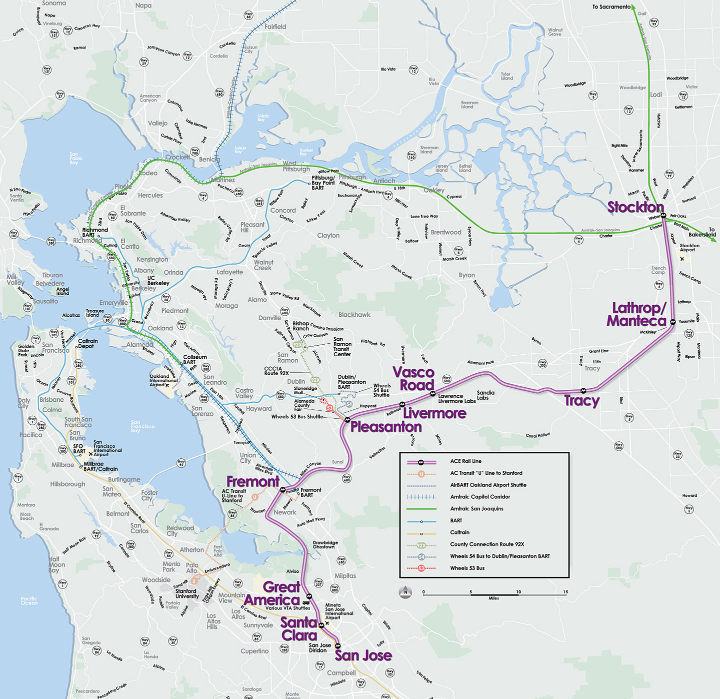
We built a map which matched the branding and style guide of the ACE Rail brand. The map provides first time users a clear understanding of the location of each station and the path of the journey. We used UX friendly icons that give first time users and regulars a quick one view glance of their commute. In addition to this users can hover over a specific station to find its exact address and an option to click and get further details. For example - consider your planning a trip from Stockton to San Jose. With this map interface you could easily look up information about the Stockton station
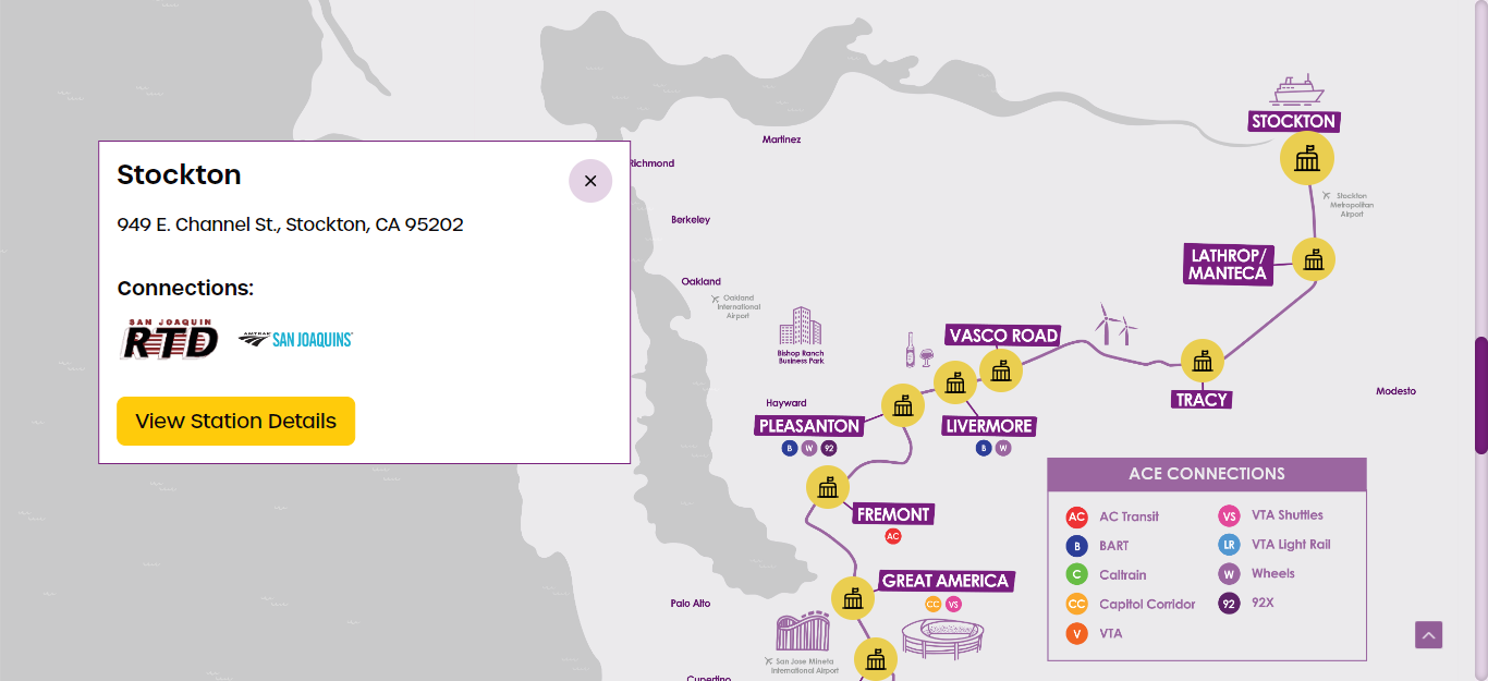
And also view the entire route map with indicators for stations along the way.
How we implemented it
Creating a Map Pointers with Coordinates / Image with map shared by designer
We went about creating this by first creating a full width component with the image provided which would resize itself based on the screen size.
The second step was creating an overlay with our icons. The cumbersome step here was to map the markers with the positions on the map. The overlay needed to be responsive, hence the positions had to be in percentages. This had to be manually done for each station. Below is the position CSS for a single marker.
The general marker CSS is also included in the above script for your information.
Fetching Data from WordPress
The data, as used on multiple pages, is stored on a custom post type called “stations”. We first used the post ID to tag all our markers (as you can see in the previous CSS). The post type also had the names, addresses and the transit partner information which we needed to show on the popup.
We achieved this by creating a shortcode which looped through all the stations and created hidden components with the data in the correct order. Each popup was marked with the post ID so we knew which popup belonged to which station.
Below is an extract from the shortcode we created.
Implementing Popup On Marker Click with Animations
Once we have a marker with the post ID and hidden popups with the post ID, we need a few Javascript statements to open the relevant popup when the marker is clicked.
The script below does that. The delay is for a simple fade effect, all done via CSS transitions.
Responsive Fixes
A little work was required to make the map responsive.
As we mentioned earlier the map was responsive, but the markers were too big for smaller screens. First step, the markers were made smaller on mobile.
On really small screens, the markers were overlapping, hence the map had to be made larger on small screens. This created a horizontally scrolling map which on mobile would extend out of the container and needed to be scrolled to be viewed completely. After a lot of testing, we decided to keep the map 960px wide to be perfectly functional.
Also the map needed to be scrolled to the center on smaller devices as it was looking odd by default. A small script helped.
Testing and Deployment
During the Testing Phase, we evaluated the design across multiple devices and browsers. The primary focus was on the route Map and connections, ensuring they functioned properly on both Desktop and Mobile devices. Random devices commonly used by users were included in the Testing Process ( iPhones, iPads, Android phones and tablets, Windows desktop etc. )
Several Challenges were encountered during testing. On certain devices, the route map wouldn’t fit correctly, resulting in blank spaces. However,we resolved this by implementing a dragging feature. Additionally, on older devices , the Station icon sizes were too small, and the pop-up for Stations appeared in incorrect locations. These issues were identified and our team was quick to resolve them speedily. While there were other challenges we faced, our QA and devops teams were in complete sync to give ACE Rail the best solution possible and provide commuters with a great travel experience.
If you liked this post or want to know more subscribe to our newsletter and follow us on LinkedIn, Facebook and X.